
What we did
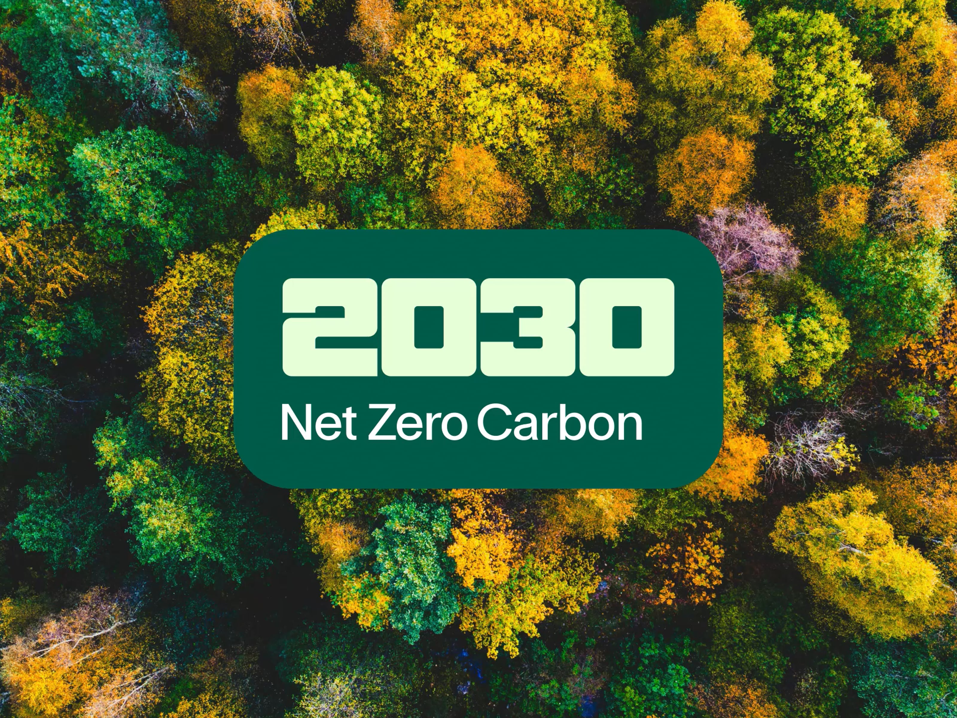
Campaign identity
Font design
Campaign rollout
A symbol for change
The campaign needed an identity that stood out from Catnic's core brand activities, while still feeling connected to it. We used the font we developed from the Catnic wordmark to create a recognisable badge, ensuring it felt distinctly Catnic without the need for multiple logos. This way, it could be seamlessly integrated across all communications, both online and offline. It also offers flexibility to update the identity as goals are achieved and new ones are set.
The brand palette already featured green tones to highlight its sustainability efforts, so we made these the primary colours for the campaign. This creates an instant visual link to Catnic’s sustainability goals.


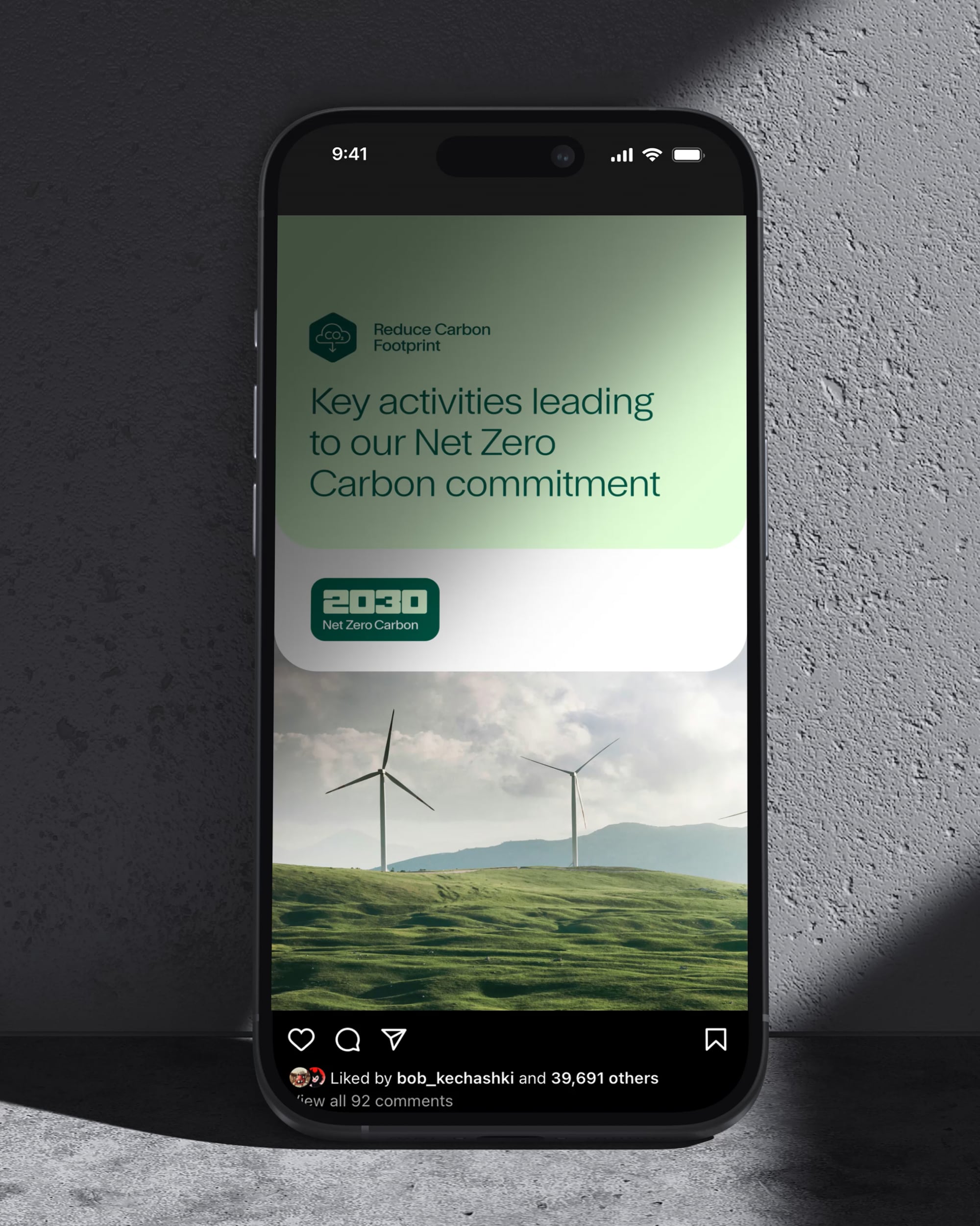
Delivering engaging content
We created a comprehensive suite of assets, including both static and animated formats, to help Catnic communicate its goals and targets in a more engaging and dynamic way. By combining visuals with clear messaging, we made the information more accessible and memorable. The language and figures are kept simple and easy to understand, ensuring the audience can quickly grasp the key points and takeaways without feeling overwhelmed.
As a Tata Steel enterprise, Catnic had previously used its sustainability assets. We created new icons in the updated brand style to represent its net zero carbon commitments, alongside other key goals like protecting biodiversity and maximising material efficiency.


Toward’s proposal and pitch were incredibly insightful and creative, helping us align a visual identity with an extremely important sustainability commitment. Their approach brought our vision to life in a way that resonated with both internal and external stakeholders. We are grateful for their support in shaping a campaign that truly reflects our values.
Charmaine Dean
Marketing Manager
Find out more about our branding services and how we can transform your business
Branding Services
