Catnic is a leading manufacturer of steel construction products for the residential sector across the UK and Europe and have partnered with Toward for over ten years. We have now helped Catnic to redefine its brand, strengthen its market position and elevate the website to increase engagement, drive sales and inspire customers.
What we did
Market Analysis
Brand Positioning
Messaging & Language
UX & Customer Journey Design
Website Design
Craft CMS Development
Visit the site
Project goals
Regain position as market leader
Outperform competitors through brand positioning and marketing, the online experience and product innovation.
Inspire customers
Engage customers through inspirational and meaningful content, carefully defined messaging and creative communications.
Re-think the digital experience
Design a new user focused website that generates sales and enquiries, with a modernised look and streamlined technical functionality.
A more flexible brand
Create a versatile design system and an adaptable approach that caters seamlessly to both businesses and customers across all marketing channels.

Results
547% increase in sales value
Huge increase in the value of sales, with over 600 direct sales enquiries in the 3 months since launch.
Content driving more engagement
Increased online engagement with customers able to self-serve, reducing demand on the internal team.
150% increase in new sales enquiries
The number of new sales enquiries has increased in the 3 months since launch.
We're now able to communicate more effectively with our customers by having better content and tools on the new website. The feedback has been really positive.
Charmaine Dean, Marketing Manager, Catnic

A new brand image
The new design transforms Catnic's image, presenting them as industry innovators rather than just manufacturers. It emphasises the impact of their products on finished projects, appealing to a broader audience of architects, specifiers, and home builders, while still engaging their core construction and engineering audiences.

Brand strategy & positioning
Through investment in product development and marketing, Catnic has been one of the key players in the UK construction industry for decades. But competitors had caught up by investing in brand and advertising. Catnic needed to reposition, refresh and reengage its audience.
Following a period of insight gathering and internal engagement, we delivered a new brand strategy centred around four key pillars: strength of service, product innovation, customer captivation, technical excellence. The strategy led to more customer focussed content and messaging and a refreshed visual style.
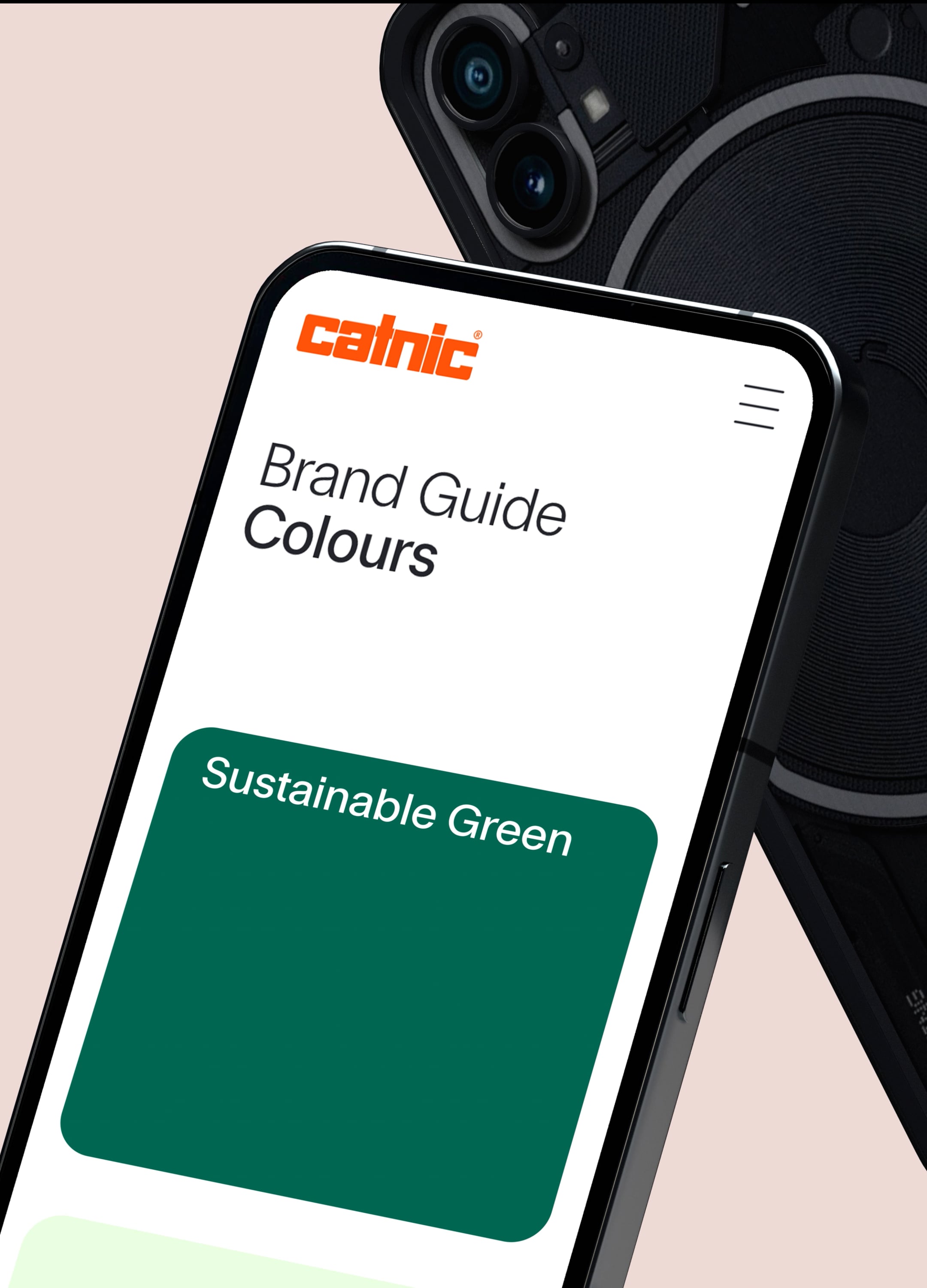
Inspired by the rounded shapes of the existing logo we developed design system that feels more connected across all applications. The dark colour palette is replaced by lighter, brighter tones creating a more modern and elegant look across the brand.


Communicating confidence & excellence
A key part of the brand strategy is to use language and messaging in a bolder, more aspirational way—focusing on benefits over features. A definitive vision statement serves as the brand's anchor, guiding the development of messaging that resonates with audiences and positions Catnic with a sense of confidence.


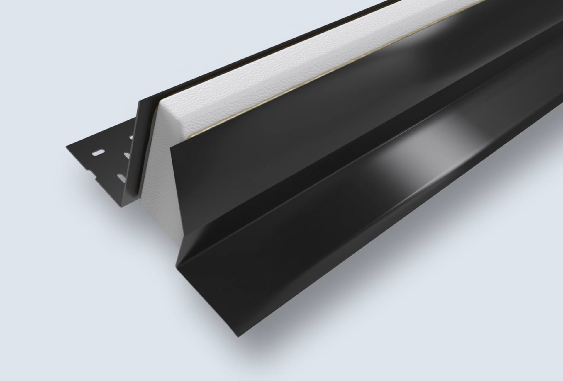
Presenting premium products
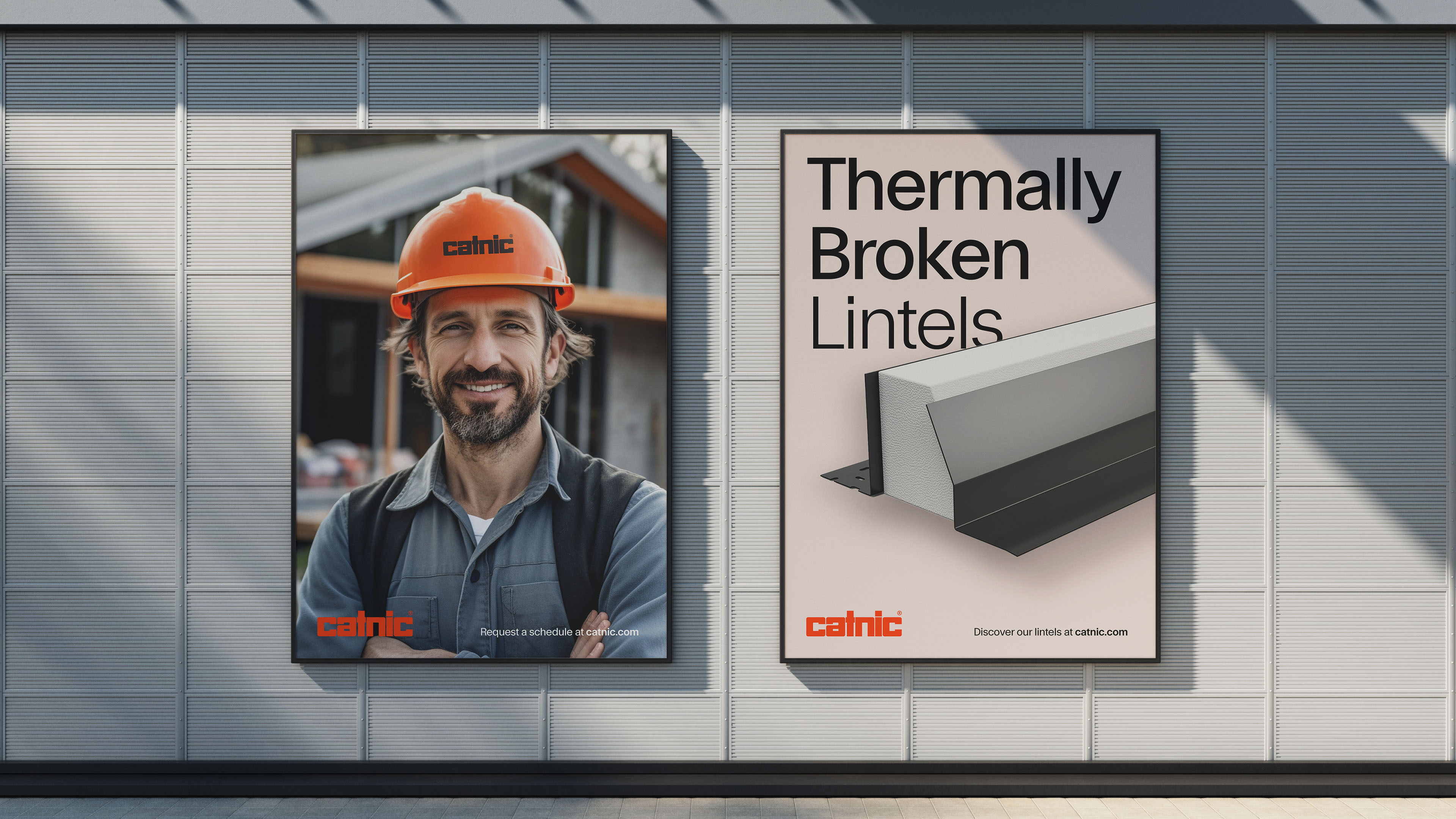
Catnic's products are the heroes of the brand. We cast a fresh perspective on their products, emphasising their technical excellence, precision, and high-end quality. By evolving the design, layout, and choice of imagery, we transformed how Catnic presented its product range.
The whole marketing suite including brochures, catalogs, advertising assets, point of sale, exhibition systems and presentations have been redesigned, introducing a fresh look with distinctive iconography and typography. This transformation has empowered Catnic to confidently interact with its audience, presenting product benefits in a more engaging and impactful way.
Our internal team love the new website—it's fresh, vibrant and easy to navigate. The new branding has reinvigorated the team and they're excited to see the evolution continue.
Charmaine Dean, Marketing Manager, Catnic



The new brand has been designed specifically with motion in mind. By using video and motion for marketing, exhibitions and the website messaging and products are brought to life and are more interactive. This investment in motion gives the Catnic a distinct advantage in the market, showcasing a commitment to quality and innovation through both its marketing and products.
Re-designing the digital experience
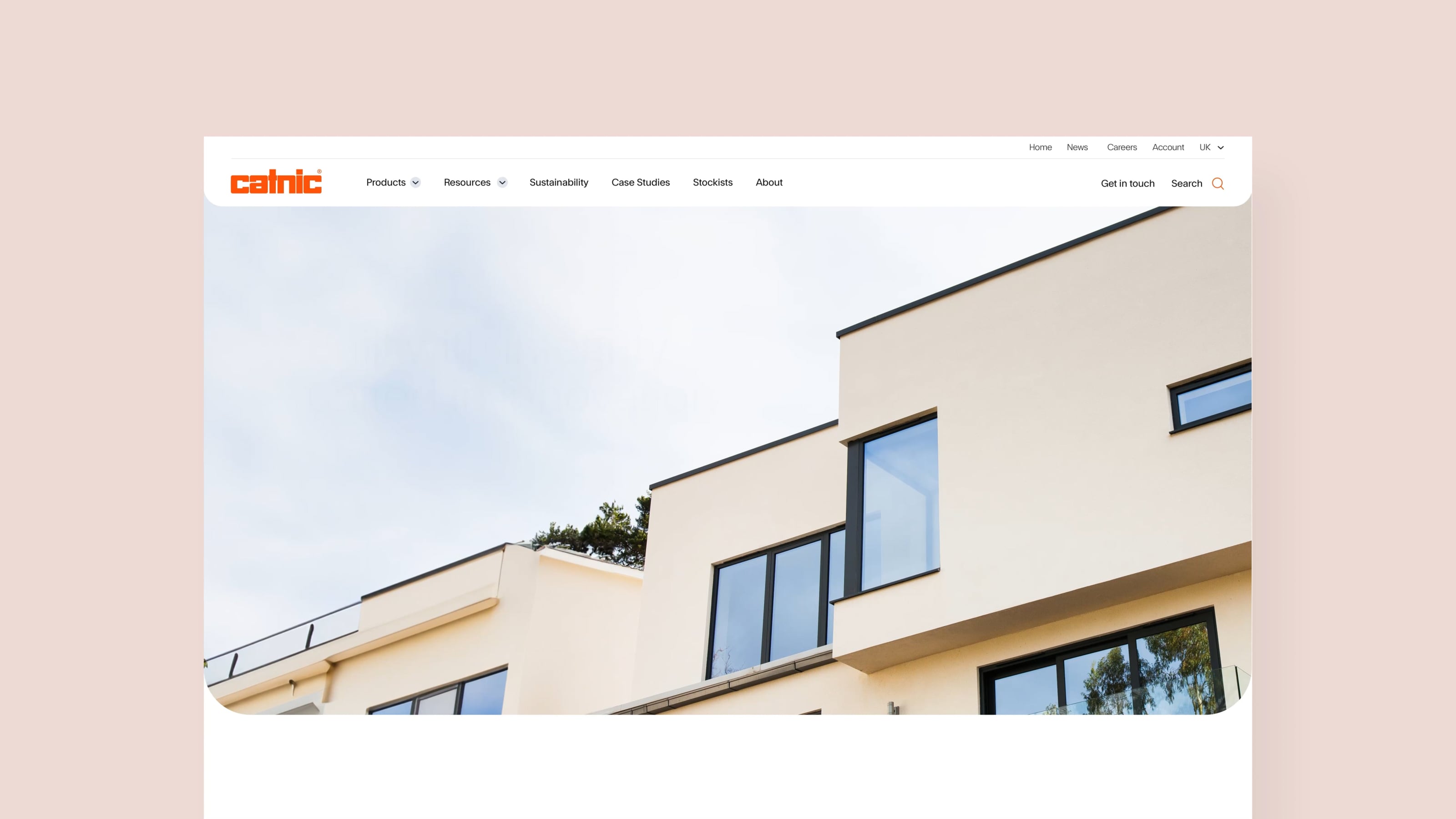
The website is the cornerstone of Catnic's marketing activity, providing technical information, product selection tools and video training. We designed and built the new Catnic website from the ground up, with a primary focus on enhancing the user experience for their target audiences. As part of our UX design phase user personas, a detailed sitemap, and user journey prototypes were developed to help us test and map out the experience.
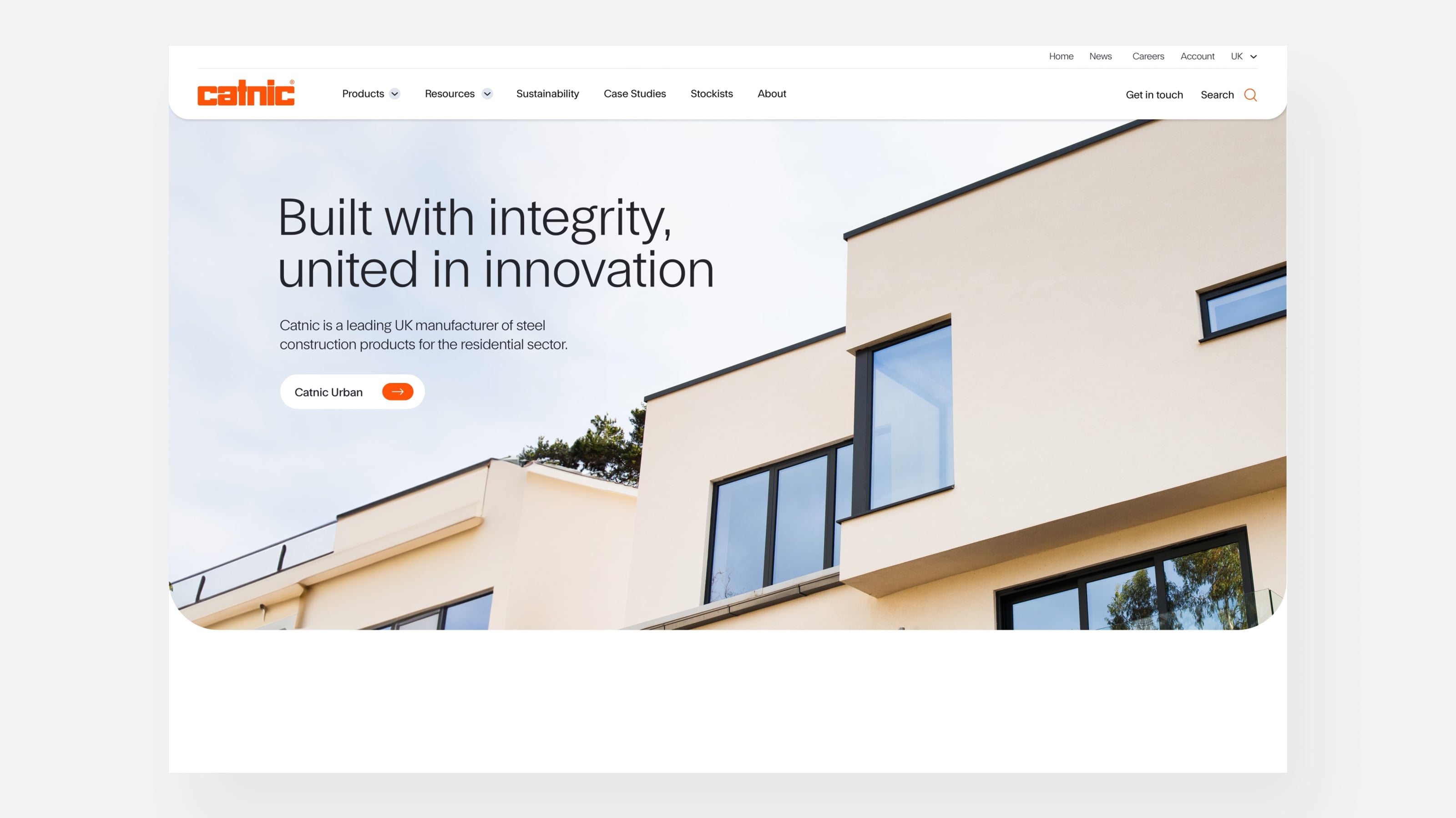
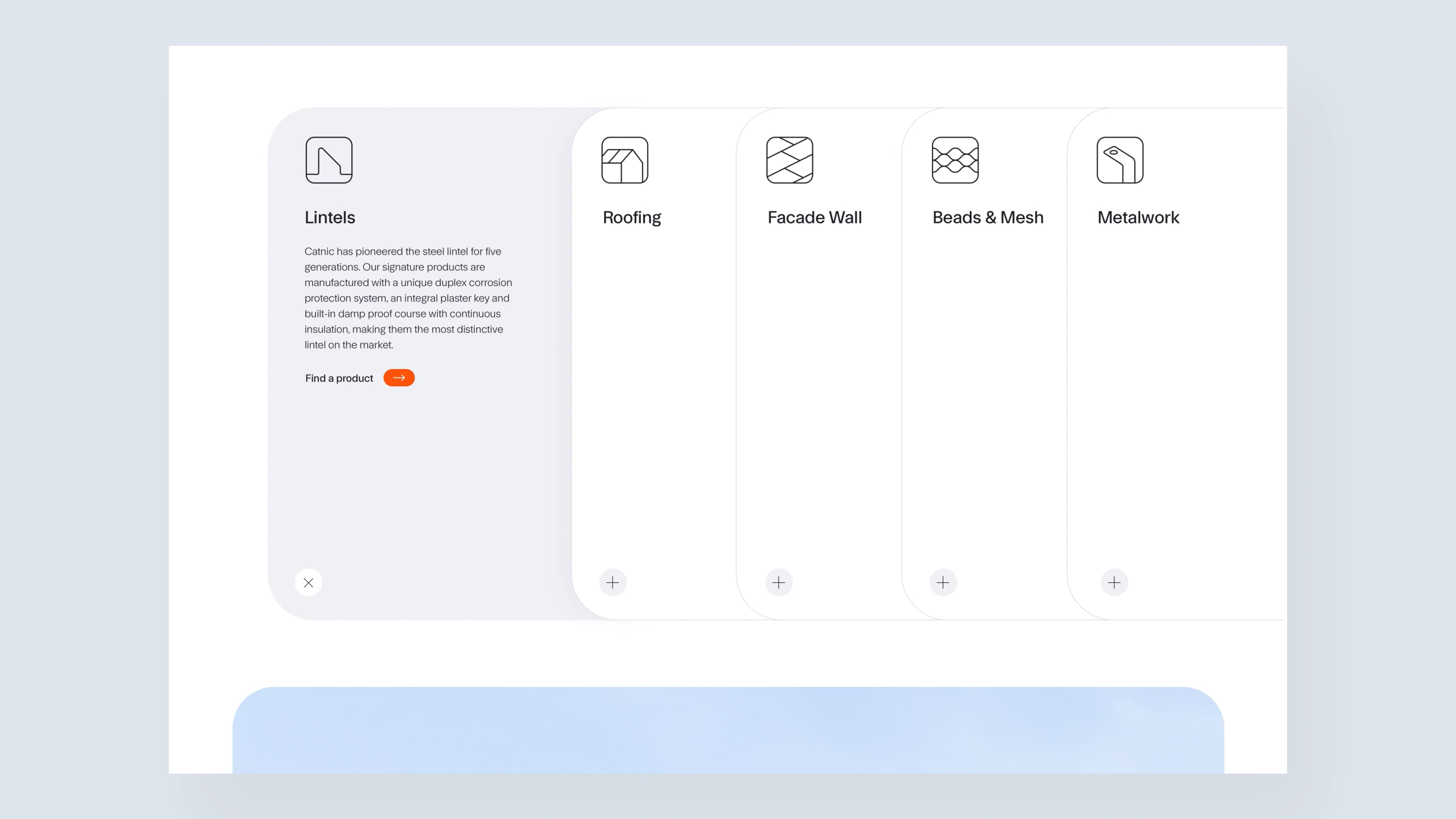
An entirely new visual design was created to incorporate the refreshed identity, introducing the modern colour palette and presentation of products. Custom built product selectors and specifiers provide quick access to product information, specifically optimised for mobile for people on building sites or at builders merchants.



Content that showcases impact
The previous website focussed specifically on the product range, showcasing them as stand alone solutions. We developed a design that utilises much more engaging photography of the products in use—showing what's possible with them.
By incorporating more aspirational imagery, Catnic can now convey a narrative in a more compelling way—highlighting sustainability and product innovation. This lifestyle-based approach also helps customers understand what's possible and delivers a more relatable online experience.



Since first working with Catnic over ten years ago, we have built long and successful partnership with the team. We can’t wait to see how the new site will help take their business to new heights over the next decade. Visit the new website at catnic.com.
Credits
3D Product Renders - Bomper Studio
SEO and migration - Liberty Marketing
The brand and website has been extremely well received by both internal and external stakeholders. The new design is clean, fresh and very visually appealing. We’re already seeing an increase in qualified leads for our newest product ranges.
Charmaine Dean, Marketing Manager, Catnic

