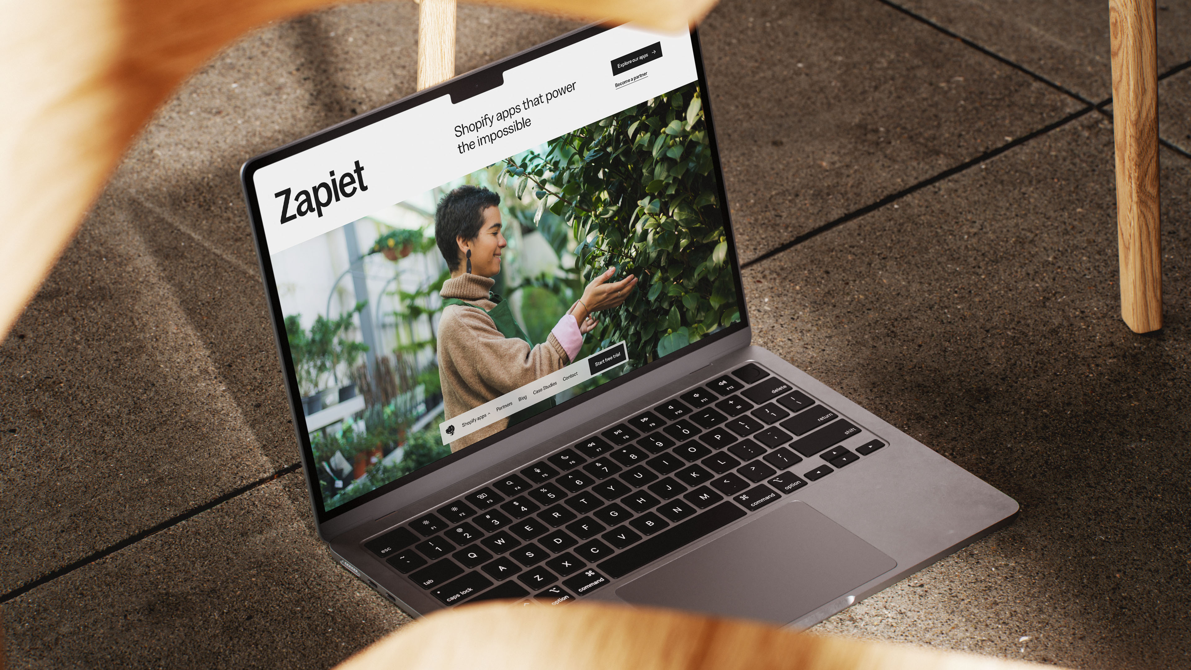
Zapiet is a Shopify app developer specialising in pickup, delivery and shipping. More than 10,000 merchants and experts rely on their apps for reliability, deep functionality and hands-on support. We worked with the team to evolve their identity, refine their positioning and redesign their website to match the performance of its products.
What we did
Discovery
Brand Strategy
Brand Identity
Brand Positioning
Website Design
Visit the site
Project goals
Elevate the brand
Evolve Zapiet’s identity so it feels clearer, more confident and better aligned with the quality of their products.
Create a stronger product family
Bring more structure and consistency to the product suite so each app is distinct yet still feels part of one brand.
Clarify the story
Refine Zapiet’s positioning and messaging to speak more directly to merchants and Shopify experts.
Website overhaul
Redesign the experience to be more accessible, easier to navigate and more helpful for the people who rely on it.
Support future growth
Build a system the team can use and extend as new products, content and opportunities come along.



Project overview
Zapiet had outgrown its brand. The logo felt unbalanced, the identity lacked consistency and maturity, and the illustrations and colour palette no longer matched the quality of the products. The website was clean but generic, with accessibility issues and declining performance. The foundations were there, but the brand wasn’t expressing who Zapiet had become.
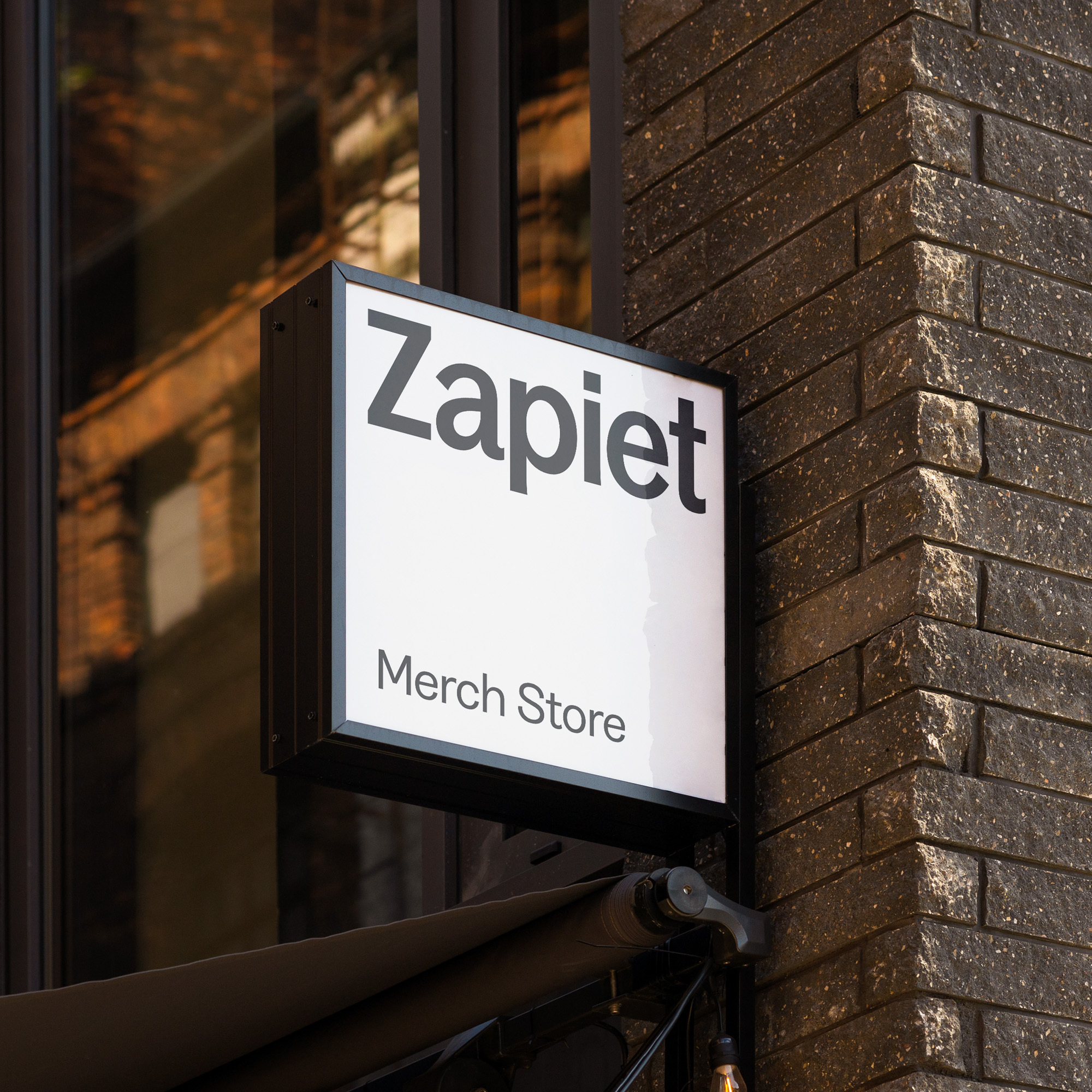
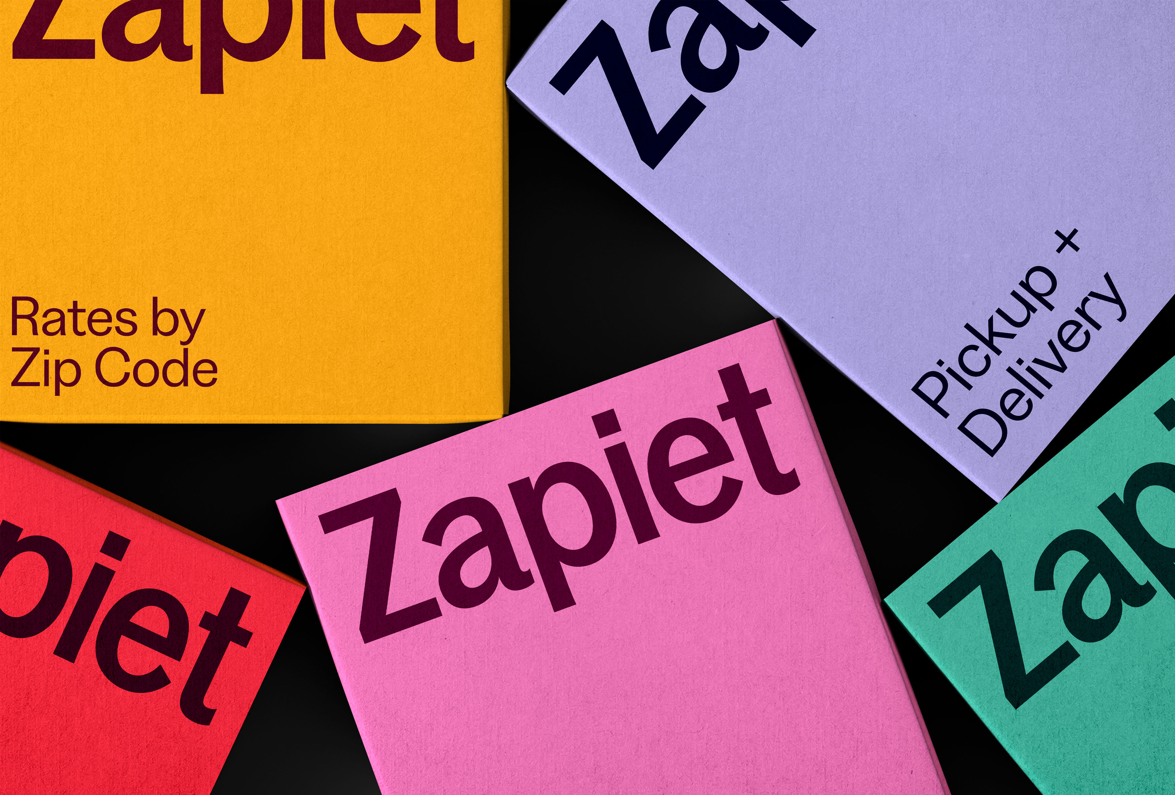
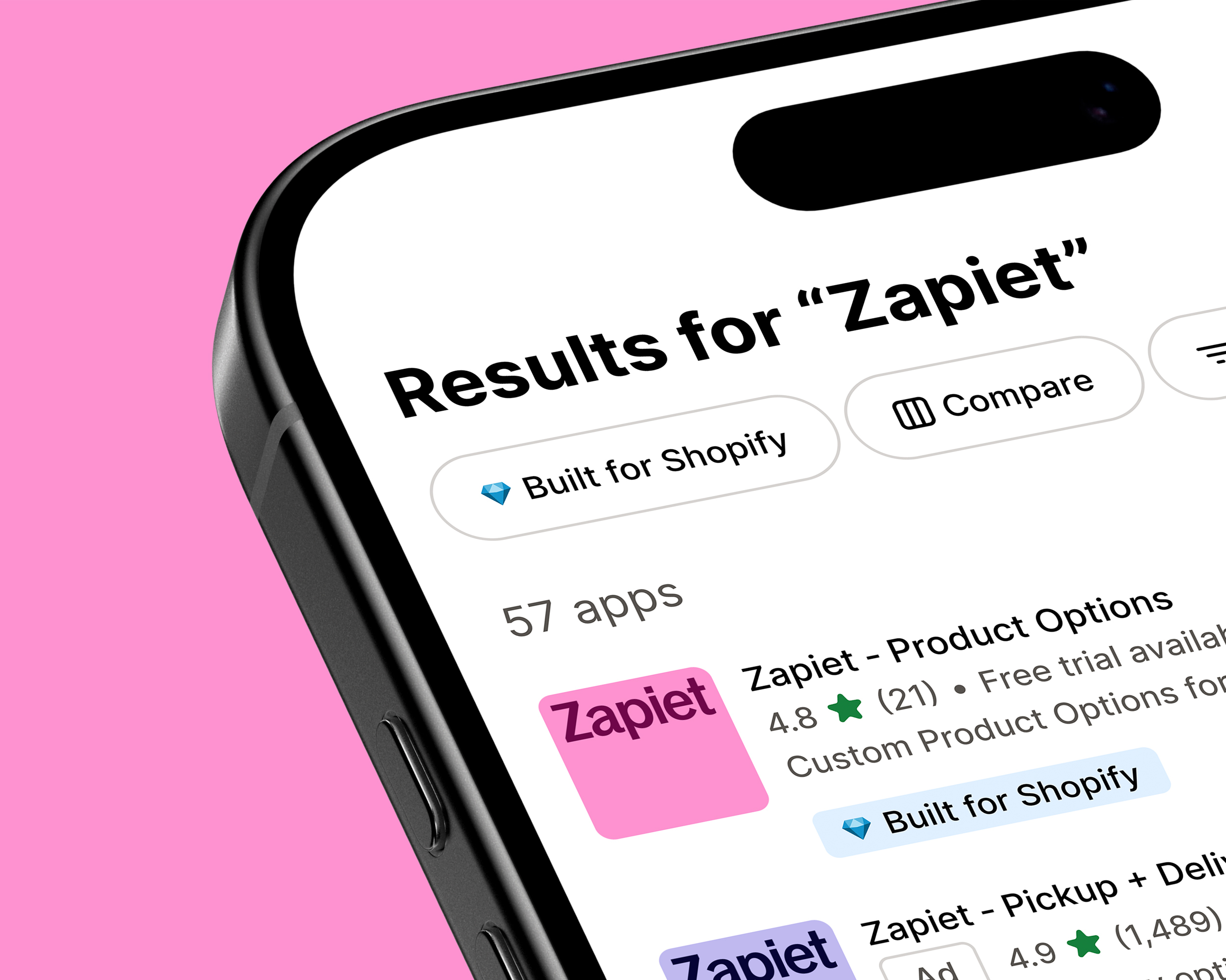
With that in mind, we began by clarifying what should stay and what needed to go. We created a simpler, cleaner wordmark to feel more intentional and compact, allowing for more impact at smaller sizes and improving legibility everywhere from the website to the app store icons. The typographic system was reset to introduce a more modern, human tone of voice, supported by a secondary style that brings clarity to detailed information across the site.
Colour followed the same approach. Zapiet’s product palettes were familiar to thousands of merchants, so we refined rather than replaced them. Each hue was adjusted to improve contrast and accessibility, with deeper tones added to soften the overall feel. The updated palette creates more balance and usability while staying recognisably Zapiet.
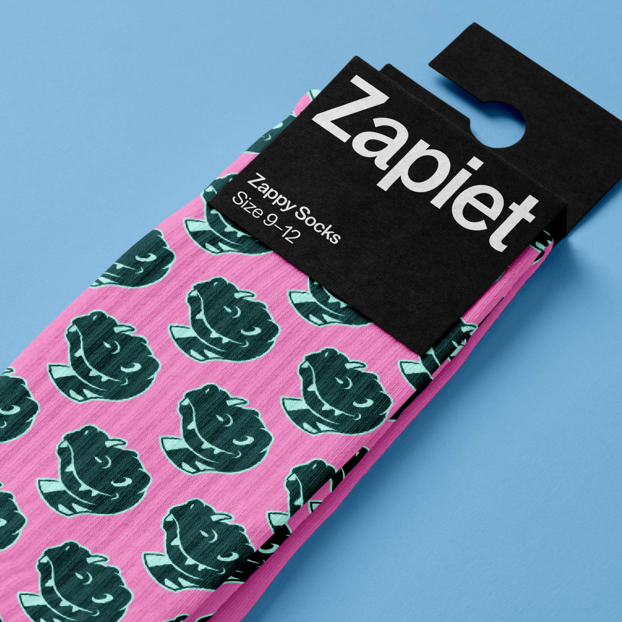
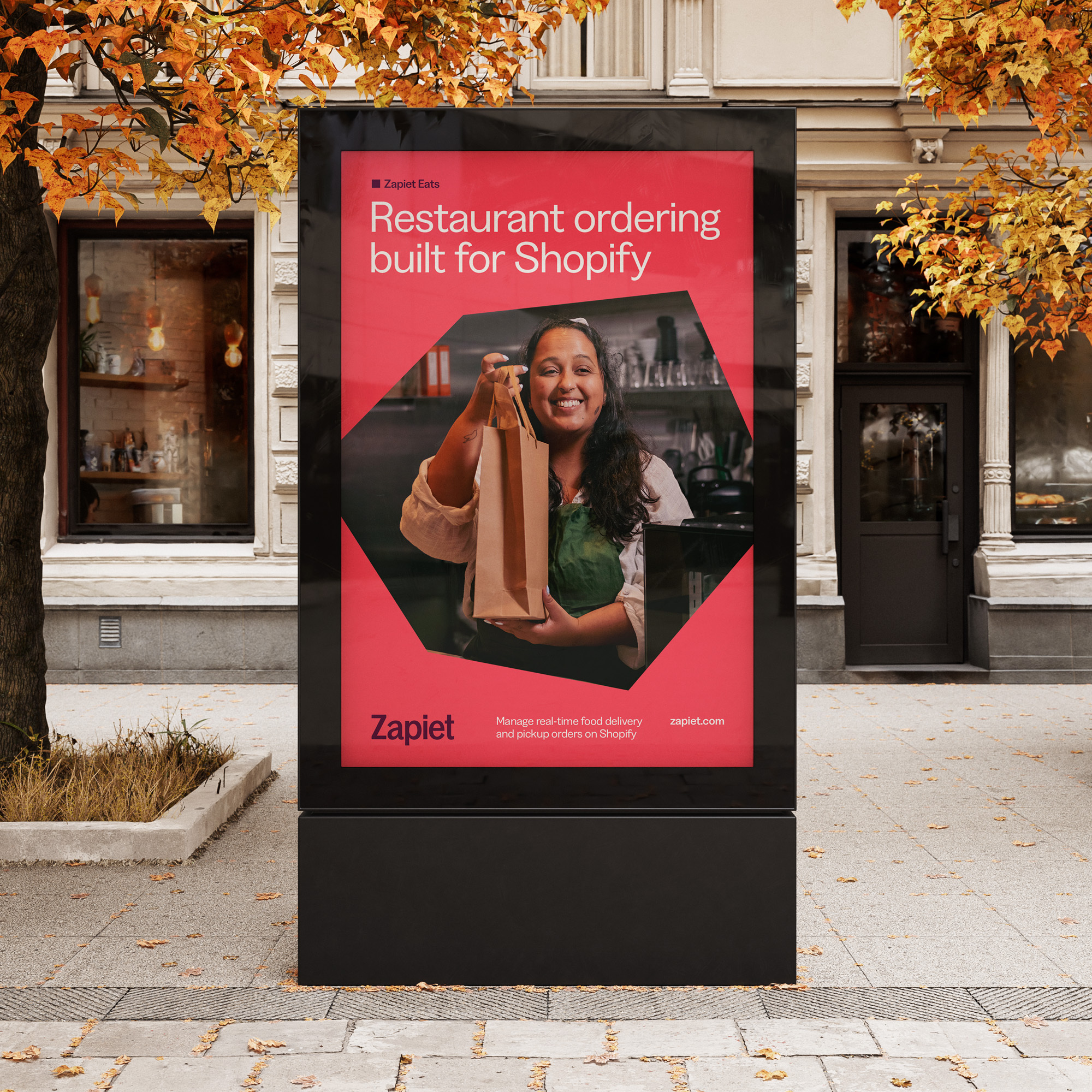
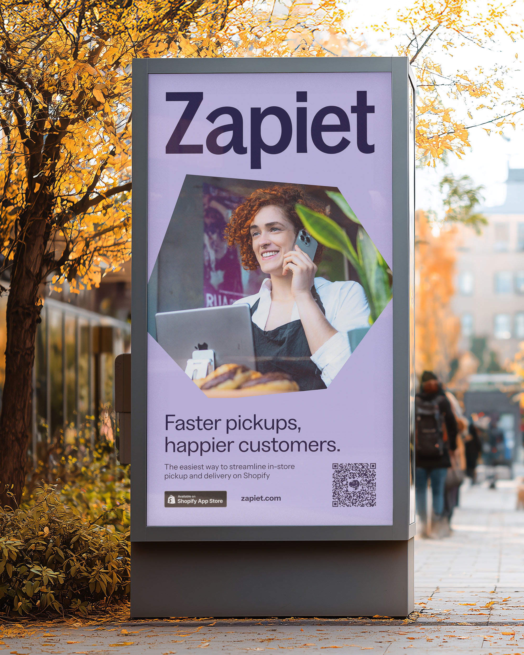
To bring together the new logo, typography and colours, we developed a new visual system for the wider brand. Inspired by parcels and deliveries, we introduced a set of shapes, frames and blocks that form a visual link to what Zapiet does. These appear throughout the website, photography and motion, giving the brand more structure and character. The photography is enhanced with a simple 3D frame treatment, creating a clearer narrative without overpowering the content.
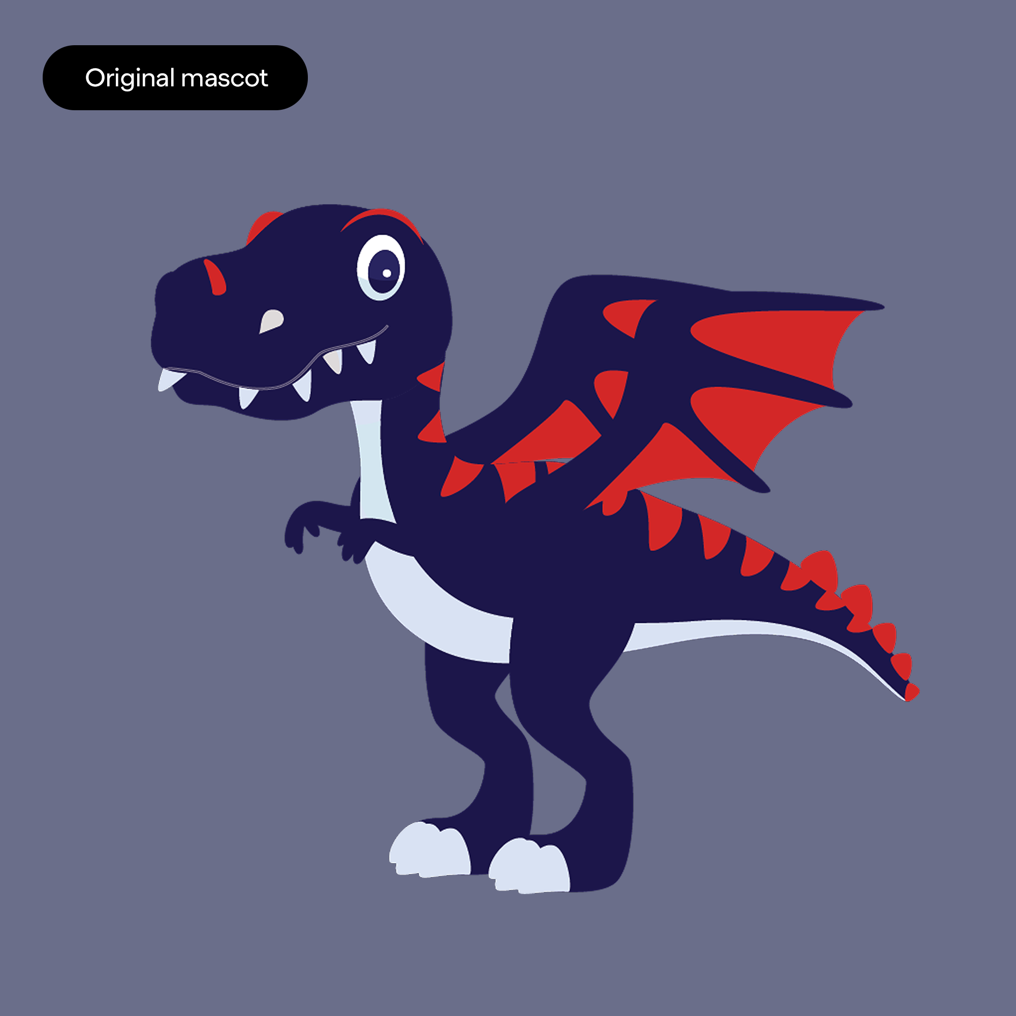
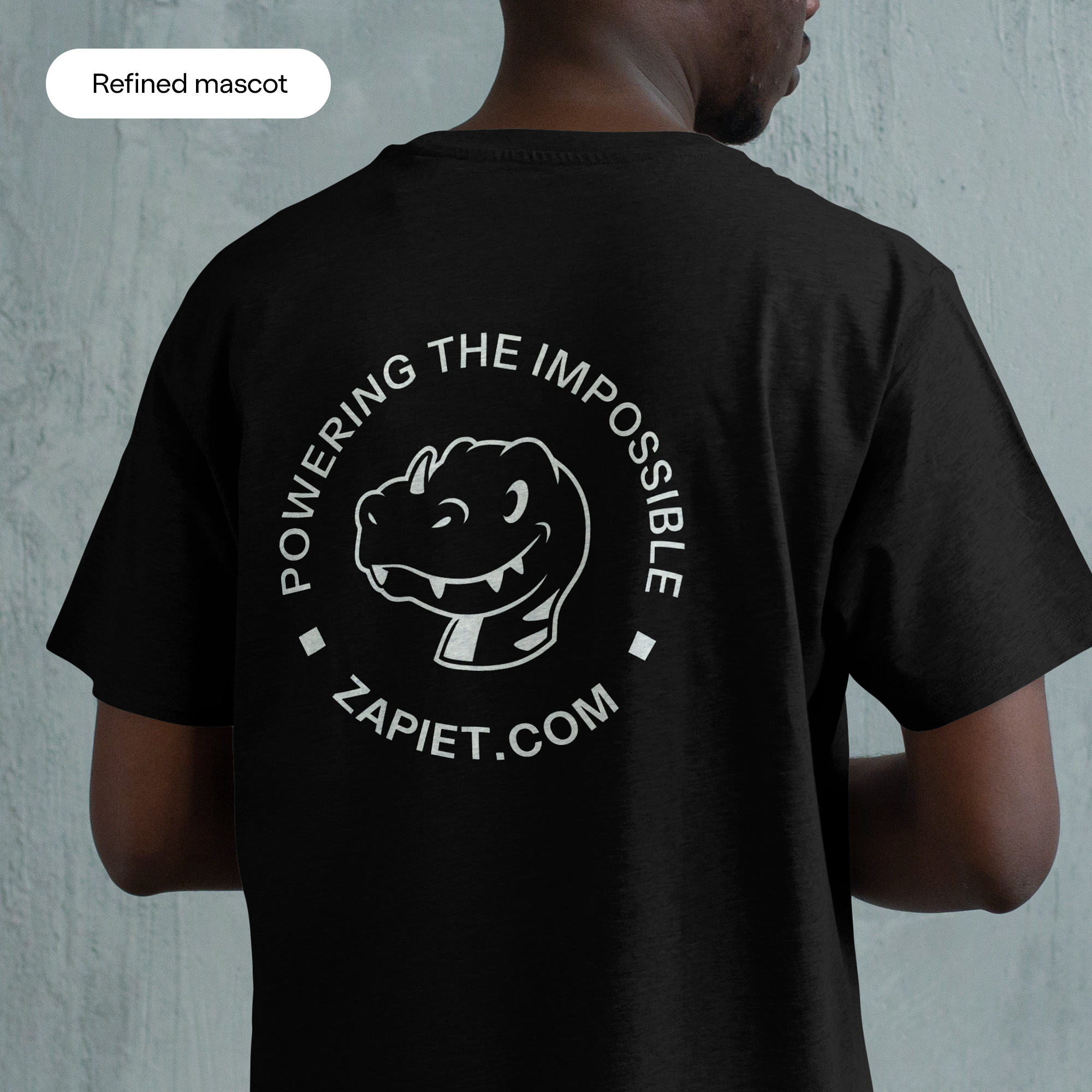
As part of this, Zapiet’s mascot, Zapietousaurus, also needed attention. It had built a loyal following but didn’t sit comfortably within the identity. We refined it into a cleaner, more iconic character that fits naturally into the system while keeping the warmth people recognised. It now works as a true brand asset rather than an occasional extra.
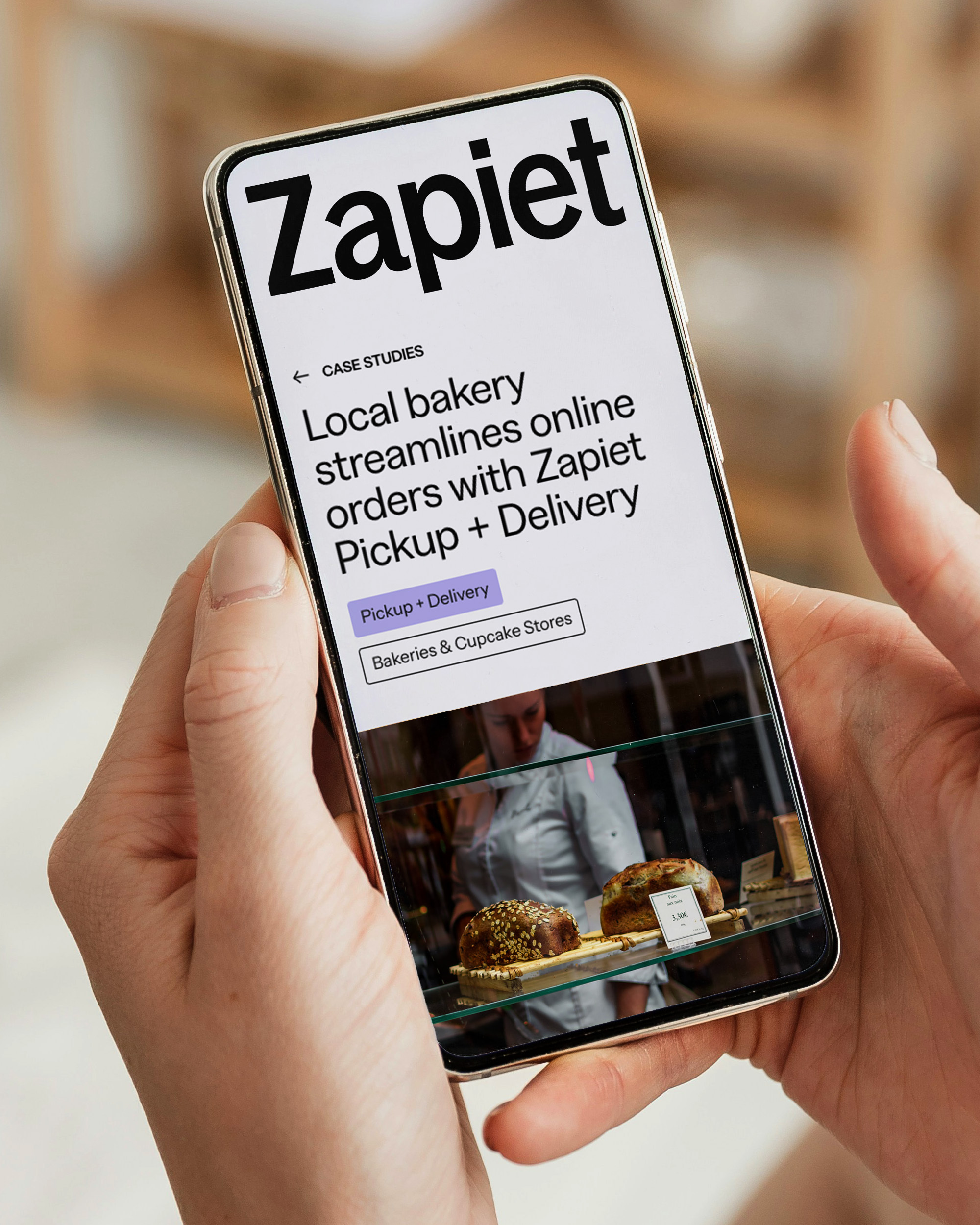
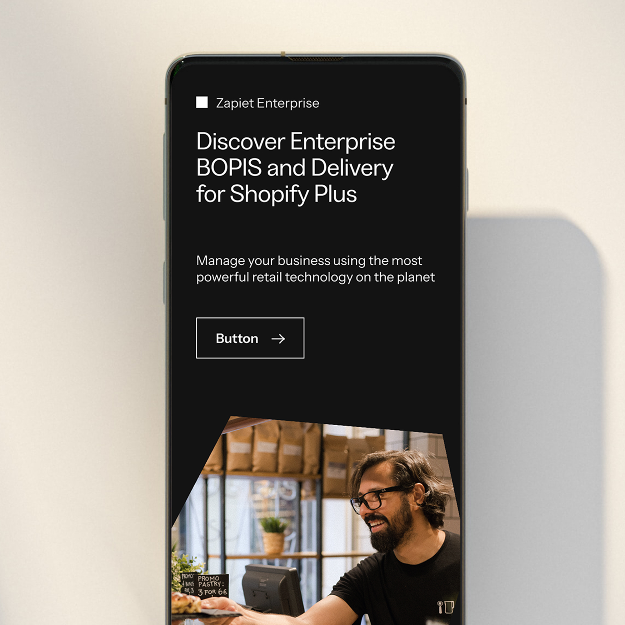
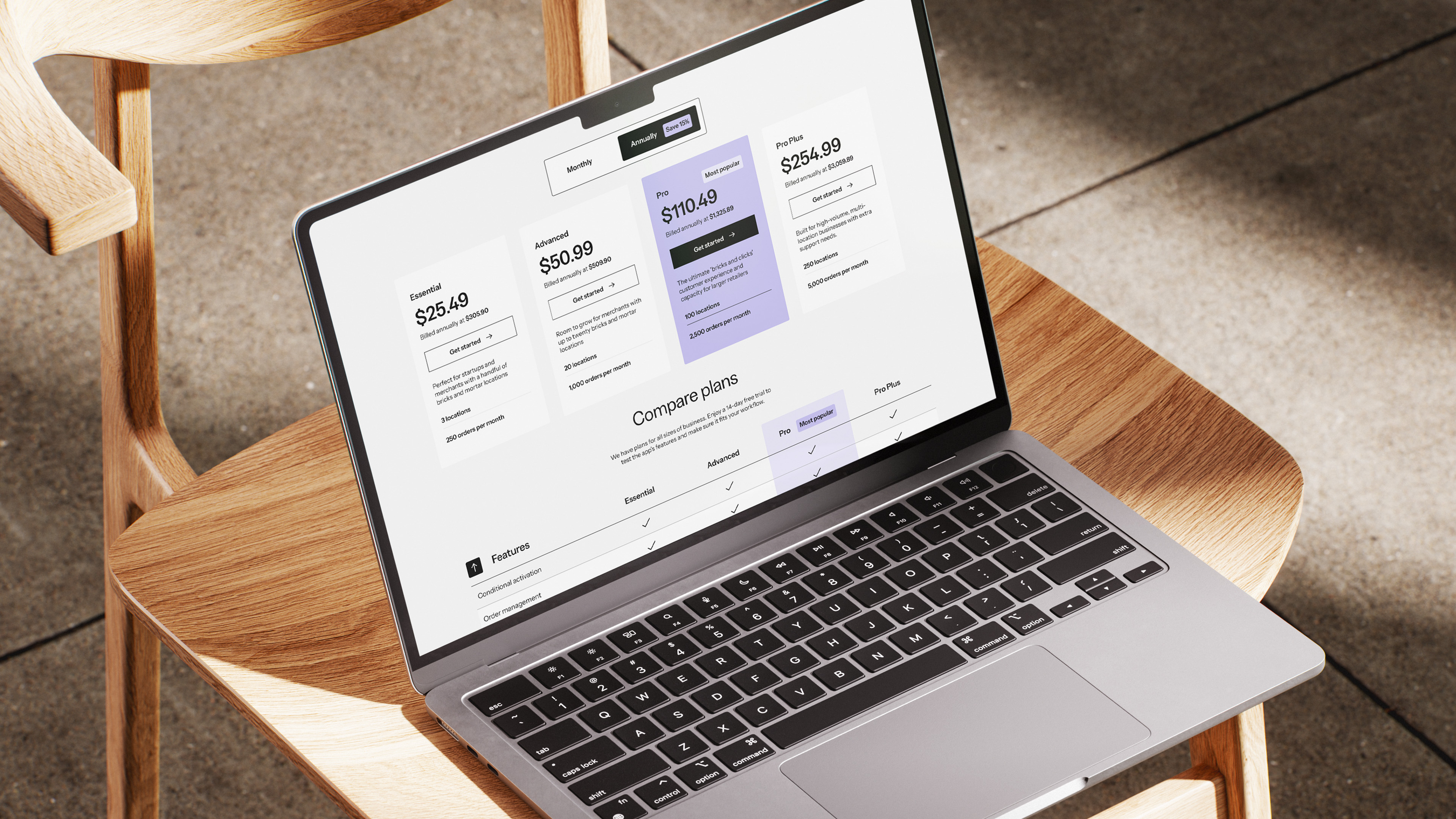
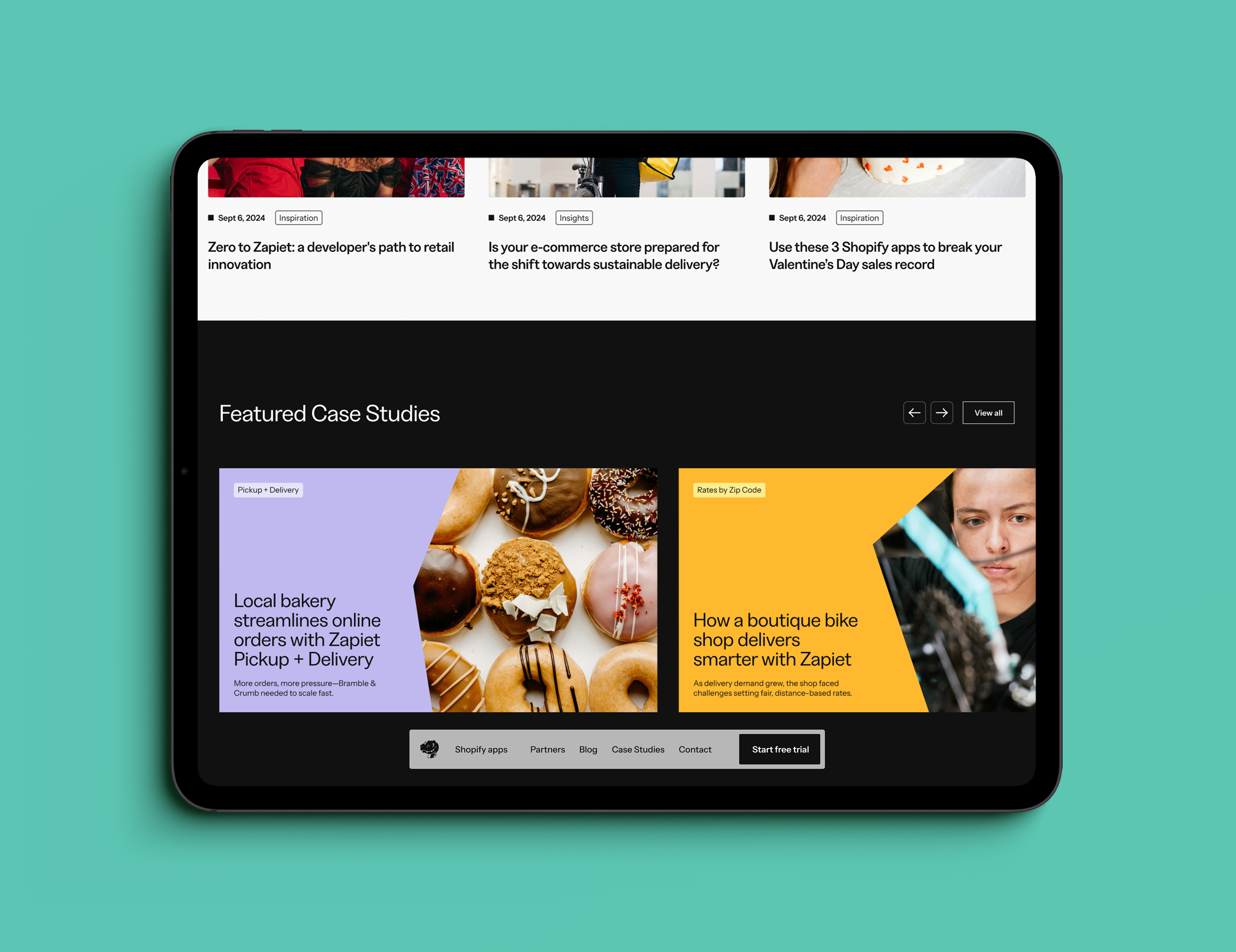
The website brings all of this together. Working closely with Zapiet’s development team, we evolved a site that was previously functional but limited, with dense product information, restrictive navigation and complex pricing tables that were hard to interpret. We restructured key journeys for merchants and Shopify experts, simplified the product pages and redesigned the pricing table to be far easier to use and understand. Case studies were introduced across product pages to show how the apps work in the real world, helping visitors understand their value quickly and with more assurance. And colour and photography add warmth, while the new design system gives the site a clearer sense of confidence.
The result is a brand and website that finally reflect Zapiet’s standing in the Shopify ecosystem: thoughtful, dependable and built with care. The system is stronger, the experience is clearer, and the identity now lives up to the products behind it.
What drew us to Toward was their reputation for exceptional typography, colour work and design. Their thinking in this area shaped a rebrand we’re genuinely proud of. The result is strong, cohesive, and has landed extremely well.
Andy Cargill — Founder & CEO, Zapiet
Find out more about our branding services and how we can transform your business
Branding Services
