Naski is an online and physical store offering the best ski equipment, clothing and apparel, plus a personalised boot fitting experience. To attract a new audience and establish its name in the industry Naski needed a brand identity, Shopify online store and suite of marketing assets.
What we did
Discovery
Brand Strategy
Brand Identity
Brand Positioning
Shopify Store
Theme Design
Visit the site
Project goals
Establish and engage
Launch the new business with an established brand identity from day one. Create a brand that people want to engage with.
Get to market quickly
Take advantage of an opportunity and create a physical store, brand, online store and marketing platform in only nine weeks.
Crafting an identity
The new company needed an identity that was flexible, adaptable and memorable. Naski shares its name with a vegetable-based mascot found at the Nozawa ski resort where founder John worked as a backcountry ski guide. Taking inspiration from its origin we developed a wordmark with subtle references to Japanese design, which is particularly evident in the stacked ‘kata’ style version of the logo.
The stylised snowflake-based logo mark also includes a subtle reference to Japanese flowers, adding to the origin, while its green colour references the original mascot. Together, they create a bold, memorable identity that reflects snow sport culture. For the Naski team, it represents nostalgia and story. For customers, it’s a brand with confidence, credibility, quality and reassurance.
With a name that carries strong meaning to its founder, we wanted to do it justice by creating a brand that not only positions them as the go-to ski store, but symbolises joy and reflects nostalgia.
Nathan Miller, Senior Designer


Communicating knowledge
Through our discovery research, we learned that buyers of ski equipment value technical expertise and knowledge during the buying process. The team at Naski have this in abundance, but it was important for the brand to create a visual reassurance.
The typography echoes the curves of the wordmark while being clear and readable when communicating technical information. A bespoke icon set provides a visual language for customers to easily understand fit, terrain, ability level and product features.


Once we spoke to Toward we were hooked. Their enthusiasm and excitement from the very first conversation was why we chose to work with them.
John Thomas, Director, Naski

Opening the online store
Alongside its physical store in Cardiff, Naski needed to open its doors to a much wider audience. It required an online store to sell products, promote its ski servicing and boot fitting consultations and tell the wider story of the brand.
We designed a Shopify theme to showcase Naski’s products, providing technical information and intuitive purchasing options, including the ability to collect from the store. An integration with Shopify’s in-store POS system enables the team to stay in control of stock in-store and online. To streamline the ski boot fitting service we integrated Calendly to manage bookings, reducing admin and enabling the team to focus on customers.

When we first saw the new brand, we couldn't believe it was ours. We are over the moon with how it all looks.
John Thomas, Director, Naski


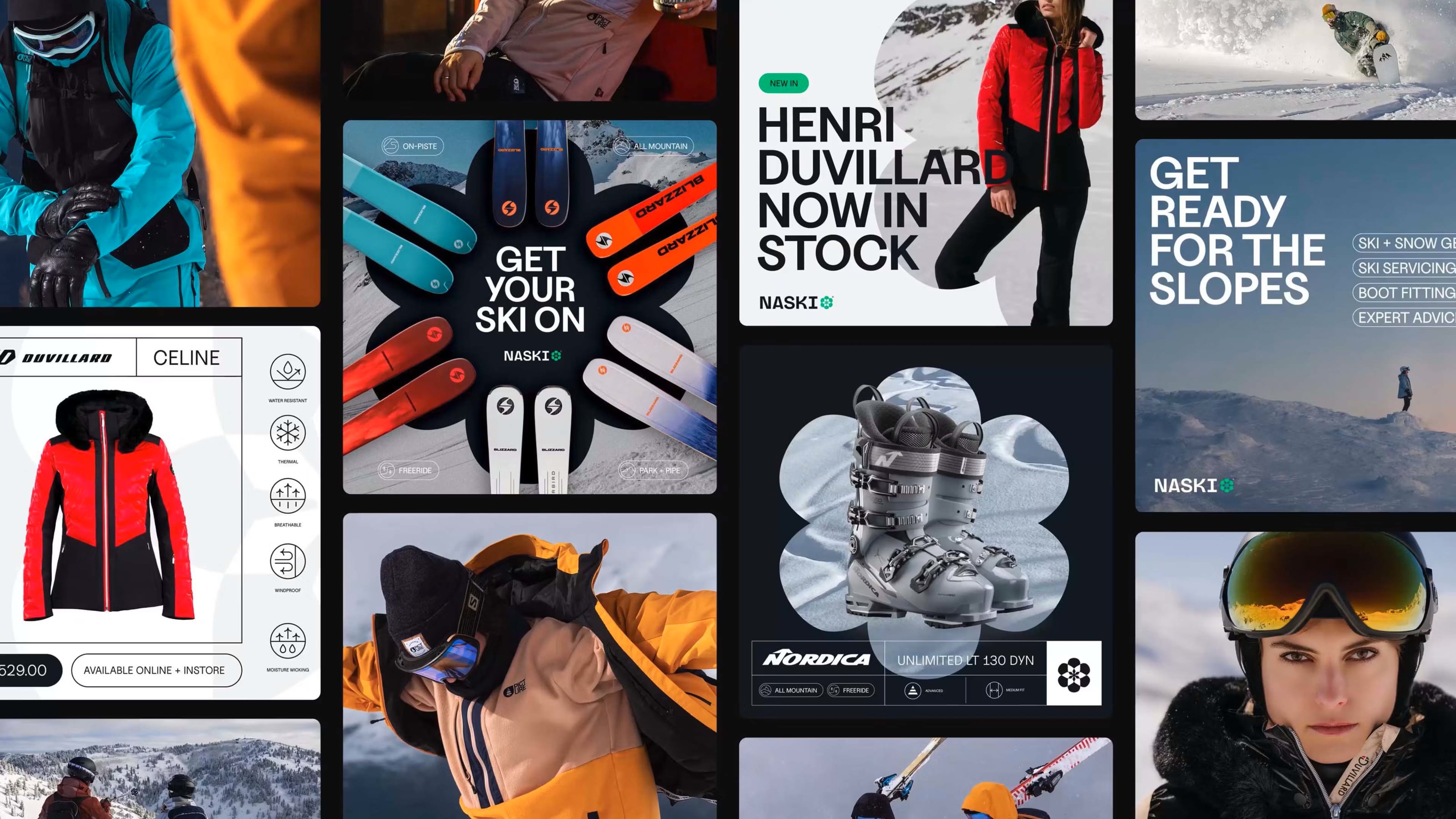
Expanding the brand
The Naski team needed the brand to expand beyond the online store, following the experience into the physical store signage, product labelling, merch and marketing materials.
The brand is applied with a blend of bold and technical approaches. The logomark’s shape is used to frame lifestyle imagery or combined with products to create impact and brand connection. This is balanced with technical elements to provide product information for customers, adding flexibility to how the brand is used and creating more scope for the Naski team to create marketing collateral and comms


This is the beginning of the Naski journey, and now they have a brand and website that sets them up for success. We can't wait to see where it goes! Check out the website, and maybe pick up some sweet ski gear at naskisports.co.uk
Our customers often comment on how great our brand is, and how easy the website is to use. If you're looking for an agency who genuinely care about your brand and website, I can highly recommend Toward.
John Thomas, Director, Naski

