Brief
Sudeley Castle and Gardens is one of England's oldest and most spectacular historical sites, featuring over 1000 years of history. We were asked by the marketing team to refine Sudeley's brand identity and develop a website that would promote its offering and increase sales revenue.
Outcome
By designing and rebuilding their website including their ticket booking and payment system, we brought their brand up to date. Creating a digital friendly Sudeley Castle experience which would help them get the most out of their beautiful attraction.
Results
56% Increase in online ticket sales
30% Drop in bounce rate

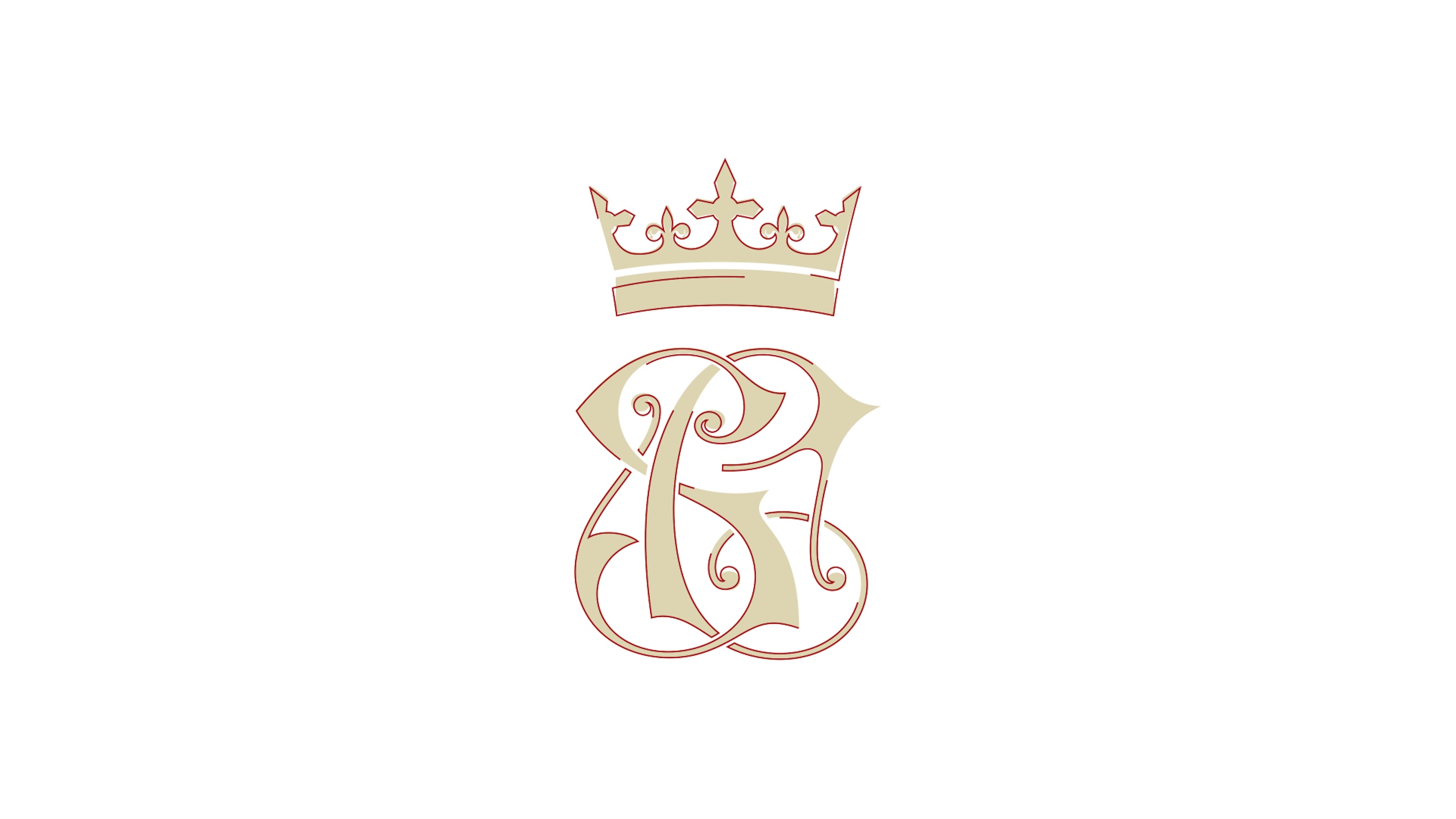
Alongside the redrawn crest we developed a refined brand identity, including a fresh colour palette, updated typography and design system that is flexible and makes the most of photography. To test the new identity elements, we produced design experiments, focusing on mobile components and layouts.


Using the editable components, varied layouts and the design system, editors can create pages that feel unique, but connected. Users now find it easier to discover relevant content, navigate to key areas and engage with the site.


Analytics showed that the majority of visitors were using mobile devices, despite the old site having being quite difficult to use on smaller screens. We designed the site and the ticket booking experience for mobile as the primary experience, introducing sticky navigation to help visitors quickly access navigation as well as being able to book tickets from any page. We also considered the use of photography across the site, making the most of the great imagery at smaller device sizes.


We rebuilt the whole ticket booking and payment system using Craft Commerce. Our design and development teams worked closely, prototyping, testing & iterating on the user experience to provide the best booking flow possible. The new system can now handle multiple purchases such as tickets, gift tickets, experiences and products.


