Brief
Over 13 years ago, Mazuma set out to make accountancy a hassle-free experience for small businesses. Now, with the tech-based market booming, they needed a fresh brand to stand out and reconnect with their audience.
Outcome
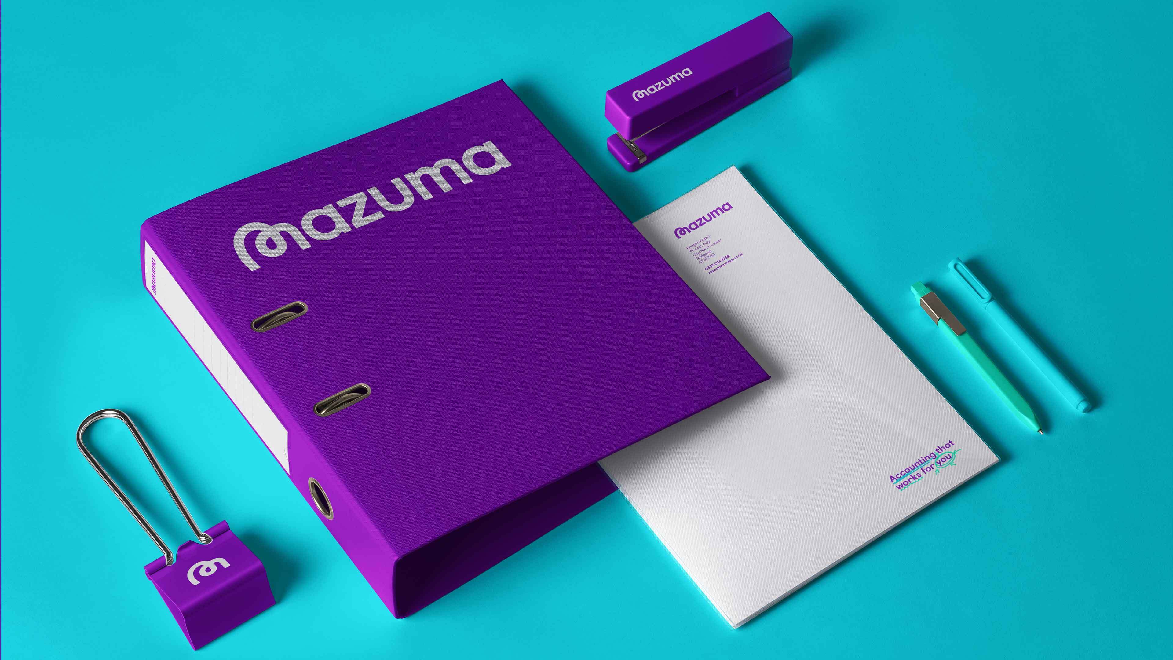
We brought Mazuma's genuine and reassuring tone to life through a visual identity that shines a spotlight on the people behind the numbers.
Focused on language, the typeface had to hit the right tone and personality. Clear and modern, Castledown had been designed to help with dyslexia making it incredibly people-friendly—the perfect fit.

Inspired by the marks and notes made on paperwork, we introduced some marks of our own. These human-made scrawls were used to convey the balance between tech and real people. It also created a visual dialogue between Mazuma and their clients using colour to help identify each focus.


To add a little quirkiness and a slight irregularity, we created a wordmark with a custom ’M' to break up the uniformity and echo the human element of the company.

Choosing a branding agency can be a nervy experience. You're entrusting your vision and reputation to someone else entirely and it's hard to figure out how on earth they're ever going to be able to see things like you do. But that's the magic of Toward.
Lucy Cohen
Co-Founder


We created a series of adverts highlighting their 'Don't worry, we've got this' philosophy. Simple and direct, they hero the busy folk Mazuma look after.


Working with Toward was such a positive experience. They absolutely understood what we were hoping to achieve and delivered way beyond our expectations. They are compassionate and professional and talented.
Lucy Cohen
Co-Founder


