Brief
Ice cream brand Batch approached us to create a bold identity to launch their new brand and product range.
Outcome
We created a bold, playful brand experience filled with personality, delivered in a premium way.
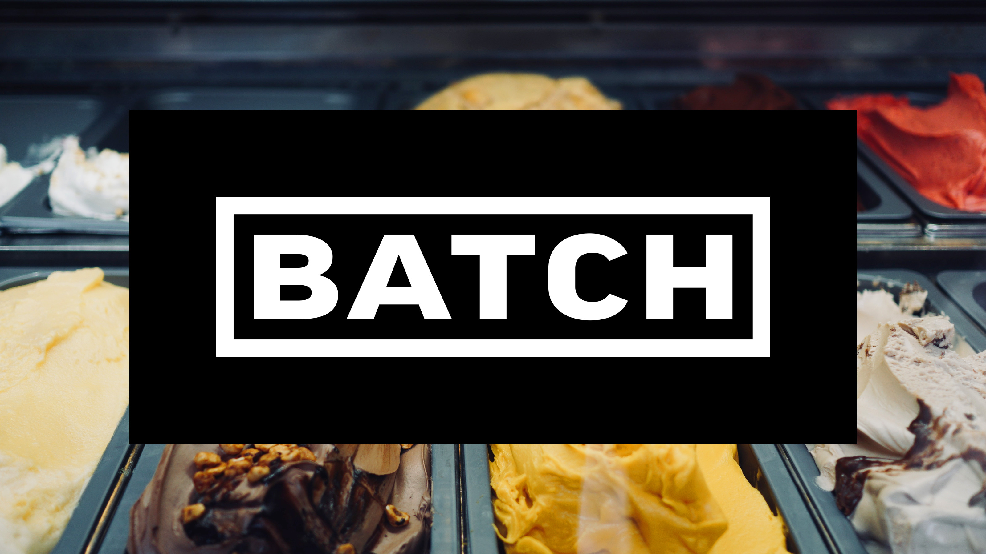
Batch serves more than 60 flavours of ice cream, displayed in all their vibrant, colourful glory. They’re the stars of this show, so the brand is monochrome. Bold typography used only in black or white creates impact and a stage for the main act.

To add energy, playfulness, recognition and flexibility to the design language we mixed up the typography, allowing it to adapt to every application. Making the words more challenging to read draws the eye and encourages people to engage more with the design, spending time working out the meaning behind messages.

As part of the identity project, we delivered a full suite of packaging, exterior and internal signage, digital menu displays and promotional materials.

Having a type led identity puts a lot of responsibility on the words that are used. Not only to communicate, but to engage and delight customers. We developed a tone of voice and wordplay that is confident, quirky, short and snappy.


