Brands that align their actions with their words serve as a powerful cornerstone for their brand identity. Crafting names that mirror a company's ethos and values offers an alternative perspective on the art of naming. Below are some instances of projects where the name directly reflects their core identity.
Action based names
Brand names that act as a driving force to what they do are often a popular choice, the benefit of these types of names are that they are directly associated with the function of the business and purpose of the brand.
In some sectors, cutting through the noise can be difficult, especially when your name isn’t connected to your services. Alternative approaches to naming are often found in the ethos, purpose and action a business stands for. These types of names can act as the centre piece to the direction of a business, team culture and help propel them into new spaces.
Toward, a name that never stops moving
If you don’t know already, we were once a design agency called Bluegg, over 20 years we grew up, our processes changed, our work got better and we were a different animal. Like most cases this called for a rebrand and name change. It was time to practise what we preached and take ourselves through our own process.

Toward Miro workshop
Design that moves
We delved into the essence of perpetual motion, incorporating it as the fundamental principle for our brand concept. A perpetual motion machine, a theoretical apparatus capable of endless work without relying on external energy, served as a metaphor woven into our brand language, visuals, and name. Aligning with the dynamic nature of our industry—constantly evolving and boundless—this concept seamlessly resonates with our studio's operational ethos. The term 'Toward' further signifies our self-sustaining energy, with our team embodying the internal force driving our perpetual progress.
We conducted internal workshops and engaged in team collaboration to elucidate our true identity, which we found rooted in our work methodology. We guide clients, businesses, and organisations along their journey, relentlessly progressing toward their goals, and then surmounting new ones. Be it through branding, website design, or campaign, we infuse this sense of purpose into every aspect of our work.

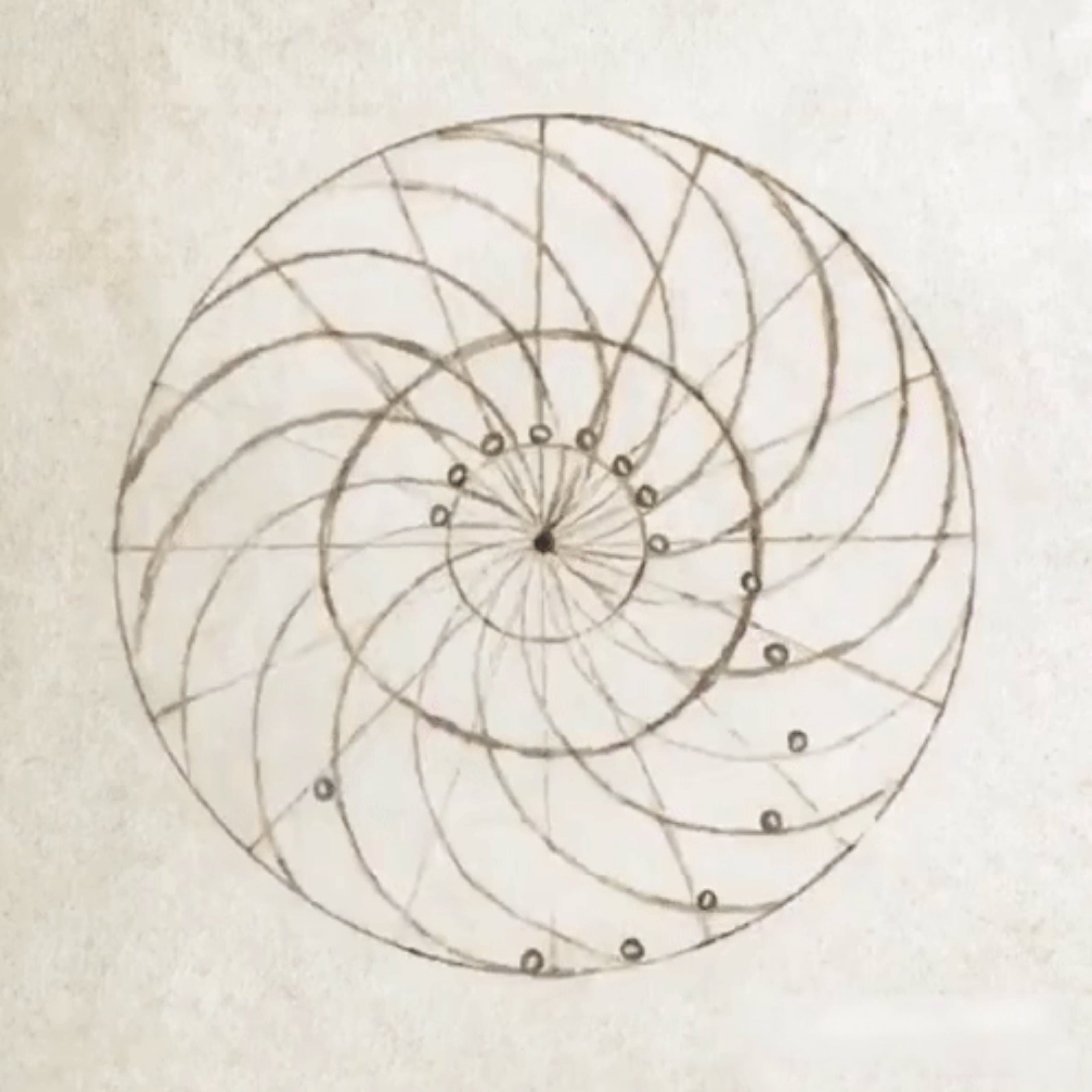

Toward represents design that moves. Sometimes literally, other times emotionally and commercially. Our work makes a difference. Moves the needle. Changes the way companies think. Sometimes we make work that moves people. Making them think differently. Commercially we make work that moves products and services. Conversions and results. We move companies. Repositioning them. Changing perceptions and ideas. The work we do moves brands Toward their goals.


Pobl, putting people first
Back in 2010, Pobl entrusted us with rebranding the companies that made up the Seren Group, as they were then known. Fast forward to 2016, when Seren Group merged with Gwalia, they turned to us once more for their renaming and rebranding. That collaboration led to the creation of the Pobl brand we know today.
We consistently acknowledge the difficulty of naming, especially for an organisation of this magnitude within a tight timeframe. The challenge was amplified by the requirement for a Welsh name, catering to both Welsh and English-speaking audiences, including city-based investors.
As a cohesive team, we embarked on an extensive research and brainstorming process, exploring words with diverse meanings. We strategically placed these words throughout the studio to stay connected to the essence of our group. Amidst this creative exploration, the solution became glaringly apparent. The name that encapsulates our identity is none other than 'Pobl,' Welsh for 'people.' Its brevity, quirkiness, intrigue, and readability make it the ideal choice for their brand.
Similar to several Welsh words, the term for people can be spelled in two ways—Pobl or Pobol. We we're drawn to the peculiar charm and subtle awkwardness of 'Pobl.' Its unconventional spelling adds a distinctive touch. We anticipated that it would be embraced by the group, eventually evolving into an integral part of their identity. Today, 'Pobl' is poised to become synonymous with the company itself, transcending its literal meaning.

Telling a human story
Centred around the essence of humanity, the brand name Pobl is a celebration of people. To mirror this focus, we curated a brand look and feel that embodies the very core of being 'human.' The creative approach introduces a style that intricately captures human emotions and illustrates the beauty of connections between individuals. The overarching aim is to evoke a sense of warmth and support whenever people think of Pobl. This commitment to a human-centric experience is reflected consistently across all visual elements of the Pobl brand.


Circle, embracing the name
Circle approached us to redefine their brand positioning to establish itself in a new market, and to add value—with the aim of being acquired within five years. Challenging the typical ‘IT company’ format. Our goal was to deliver an ambitious, colourful and interactive brand that captured Circle’s energy, ingenuity and drive. We worked closely with their team, educating them along the way up to the point of acquisition where they realised their ambitious valuation to become part of The Arrow Group.
While not all our clients seek a new name, it's crucial to highlight the potency inherent in existing names. Here's a project where we harnessed the simplicity of a circle, utilising it as a brand mechanism to effectively convey the brand's narrative.
The beginning of our journey involved creating a brand that emphasised their vision and gave them the tools to communicate their vast range of services, we began with their name. The 'IT' acronym often led to confusion as it naturally resembled the word 'it.' To resolve this, we opted for simplicity and rebranded from Circle IT to just Circle. This not only eliminated the issue but also enhanced the clarity and visual strength of our brand.

Circle IT brand workshop
The power of circles
Commencing with the circle as a clear foundation, we departed from the conventional 'IT company' approach. Our result was an ambitious and dynamic brand that embodies Circle's vitality, innovation, and determination. Leveraging the circle, we infused vibrancy and energy into every facet of the brand. Departing from the mundane blues and muted tones of traditional IT firms, we embraced a lively, forward-looking color palette. The circle's simplicity enables the brand to flexibly communicate various facets of its identity.


Vortex, a vehicle for change
Innovators in real-time data and predictive analytics, Vortex approached us to reposition its brand and help champion its mission for a better, decarbonised world. We delivered a strategy with an idea rooted in their name; Vortex, a swirling mass of data.
This led to the creation of a fresh brand identity and website which elevated Vortex’s market standing and provided a platform to drive their vision of sustainable cities using smart infrastructure.
With climate change being an ever-growing global crisis, Vortex's mission is to unleash the impact of real-time data and predictive analytics to help organisations make effective and informed decisions to reduce their impact on the environment. So where better place to start than their name?
We felt the name 'Vortex' carried weight from a visual perspective, offering an intriguing starting point by evoking the concept of a vortex. Drawing inspiration from a cleaner environment, our focus was on highlighting the positive impact that Vortex strives for. The name also subtly conveyed associations with a vibrant and flourishing ecosystem. Thus, the brand's look and feel naturally emerged, capturing the essence of these concepts.

Making the invisible, visible
Centred around their commitment to decarbonization, we harnessed the hexagonal structure inspired by carbon formations, this concept married perfectly with the name. The design choice served to visualise the unseen, establishing a visual style that effectively communicates the diverse scanning and monitoring technologies integrated into their products. In essence, it made the imperceptible aspects of their mission visible and tangible.
The name served as a focal point to the brand system allowing all of the visual communication to feel anchored to the brand concept of Championing
a better world.


Where is naming going?
In concluding part three of our naming series, we reflect on our projects and consider the future of naming. As branding grows in importance, from local businesses to global corporations, more people seek names that truly set them apart. But will we eventually reach a point where all the great names are taken? What will names mean in the future—will they focus more on the stories they tell or the brand's purpose?
One thing is certain: great brands are built on solid foundations that consider every aspect of the company, not just a name pulled out of thin air. So, no matter how catchy, quirky, or unique your name might be, it’s how you use it that truly counts.
Talk to us about how our branding process can help you with your brand name
Branding Services
