Storytelling is a vital tool for creating effective connections between audiences and your brand. A great name does more than encapsulate what you do. It creates an emotional response to who you are and what you stand for as a business. In part 2 of this series we look at examples of names we've created and the stories associated with them.
Emotive names
People often need multiple exposures to your brand to remember it, and they form a quick impression within seconds. This underscores the significance of a memorable, impactful brand name that can enhance brand recognition, influencing your business's success.
Not every brand name needs a direct association with the company's function; introducing ambiguity can enhance the name's versatility. Inventive and unique names can establish their own identity. Take 'Uber' for example, whose connection to taxi services only becomes apparent once their services are understood. We've formulated brand strategies for companies employing such names, using the name itself as a cornerstone for conveying the transformative impact they bring.
Enora—creating an aura around customers
Frontier Medical, the market leader in the treatment and prevention of pressure sores approached us to develop a new direct to consumer brand as part of their growth strategy into a new market. The core product range consists of sitting and sleeping comfort aids using air technology to provide support and relief.
Our priority was to create a name that resonated emotionally with customers, was memorable and ownable, and differentiated the brand from other medical products. Through a discovery process, using insight and research we developed the name Enora.

The Aura concept
Enora draws from two key concepts: the action and the impact. The action, 'Enable,' consistently surfaced in discussions regarding the brand's purpose and vision. Products designed to enable people to enjoy a better quality of life. The impact, 'Aura' is derived from the sense of support, protection and security customers feel while using the products.

Enora emerged as not merely a name but as the foundation upon which the entire brand strategy was crafted. The name seamlessly integrated into every aspect of the brand, serving as a unifying thread that connected the visual brand, tone of voice, and messaging.
The result is a versatile brand identity compatible with imagery, illustration and product photography. Our aim was to create a name that enabled the brand to evolve, adapting to new product innovations and market changes, while still representing the core values of the company.


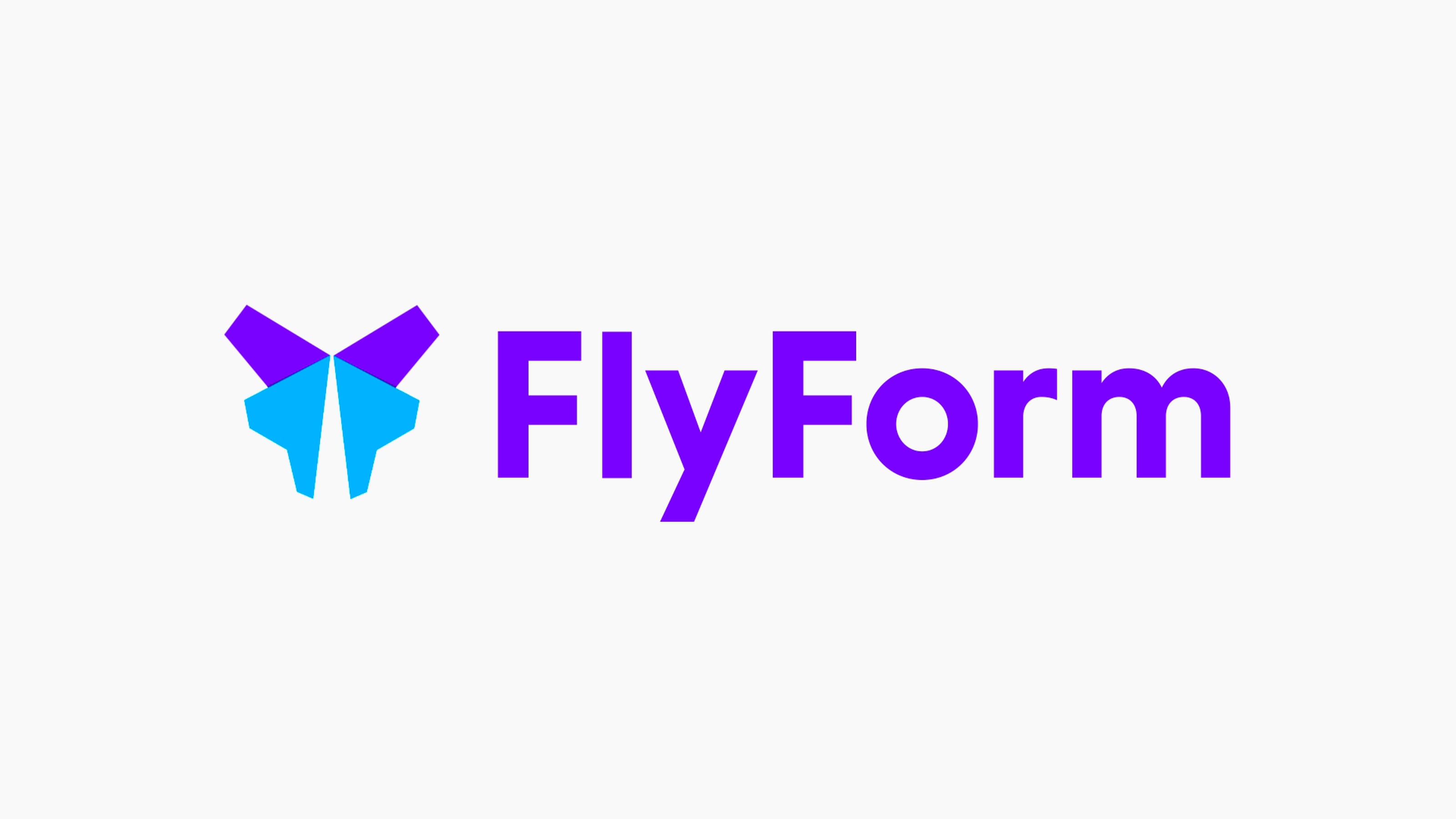
Flyform—a transformational name
FlyForm, formerly known as GOVNOW, is a consultancy specialising in guiding large organisations through the strategy and implementation of the ServiceNow platform. ServiceNow is a cloud platform designed to streamline work processes, enhancing both employee and customer experiences. Originally focused on government departments, the company expanded its scope due to its ambitious nature. Now, FlyForm collaborates with diverse enterprises on ServiceNow implementations, helping organisations run more efficiently and setting them up for success.
The first step in finding the perfect name was to run a workshop, where we broke down the audience, the brand personality, the market and the opportunity. While analysing the competitor landscape we found a number of opportunities to differentiate.
The core competitors have very technical names that lack a visual brand story. They struggle to express themselves creatively. We felt that a name that asked a question and created visual metaphors would serve as a good start for the brand.
When creating a new name for a business we try to make sure it does these things:
- Does it capture the imagination and start a conversation, rather than being obvious?
- Is it memorable?
- Does it stand out in the market against the competitor landscape?
- Does it start a brand story that has meaning and can be expressed visually?

The butterfly, a visual brand story
Through our research we found that GOVNOW provided two core value propositions:
- Freedom—creating flexibility to use the ServiceNow platform to manage any part of the business.
- Transformation—transforming the IT infrastructure of a company, fundamentally changing how companies manage themselves.
These insights led us to ‘FlyForm’—the freedom to transform, represented by a butterfly which is synonymous with transformation and metamorphosis. The name and identity are designed to encapsulate the brands' mission of transforming IT infrastructures into elegant ServiceNow implementations, enabling clients to thrive and expand.
The symbolic butterfly not only tells a visual brand story, but also creates a distinct identity, different from any other ServiceNow partner.


Sorbet, standing out from competition
Koherent was a proptech startup, building software and apps to help estate agents manage maintenance reports, inspections and appointments between tenants and contractors. In a market full of tired and mundane software, ‘Koherent’ sounded like the sort of name that fitted in, rather than standing out. The more the team told us about their plans, the more we saw the opportunity to disrupt an industry.
Property maintenance doesn't have to sound boring
We proposed a change in name, recognising the necessity for a brand identity infused with greater personality, broader scope, and enhanced appeal. Through a name brainstorming process we shortlisted a selection of potential options. ‘Sorbet’ was selected, driven by its connotations of freshness, vibrancy, and a deliberate departure from the mundane perceptions typically associated with property maintenance.
Sorbet represented a novel and disruptive approach, providing us with the canvas to build a brand that embodied these distinctive qualities.
We created a completely refreshed brand style, incorporating unique illustrations and icons. Additionally, we undertook the design and construction of the marketing site, ushering in a comprehensive transformation for the brand.


Candleston, a connection to its roots
Melin, a leading non-profit social housing provider, started a new commercial venture for their home-building arm and tasked us with crafting a name and brand. This involved understanding Melin's values and mission to ensure the resulting name and brand reflected the organisation's ethos and connected with their audience.
The new company's goal was not just to just fit into the market, but to be one of its front runners, taking on trusted and well established housing developers such as Redrow and Taylor Wimpey. The challenge was to create a name that oozed quality, emoted trust and reflected their values of building and caring for communities instilled from many years providing social housing.
It’s all in the name
We wanted the new name to embody the core values and personality of the new company; trustworthy, quality, professional, friendly and reassuring. But also incorporate a sense of heritage, a connection to its Welsh roots and have a story to tell.

When looking at what ‘home’ meant to people, we focused on the saying ‘a man’s home is his castle’, and the sentiment behind it—a place of safety and security. Inspired by this, we began digging into Welsh history and discovered Candleston Castle. As one of the earliest domestic buildings built in south Wales, we felt that the name ‘Candleston’ perfectly fitted the organisation and had a story to build from.


Talk to us about how our branding process can help you with your brand name
Branding ServicesUp next Part 3. Names instilled by ethos
In the concluding instalment of our three-part series, we delve into names inspired by action. We examine naming projects where the name is closely linked to the service, product, and mission. We'll explore our strategic methodologies for enhancing, repositioning, and developing names of this nature.

