A pioneer of innovative military equipment, JayJays has been setting the benchmark for quality and product development for over three decades. This is how we helped shape its new brand ready to take on the world.
A 30-year journey
JayJays has an incredible history, from a modest army surplus store, the family-run business has become one of the leading trailblazers in the design and production of military-grade equipment. But, with increasing competition, the company had reached a crossroads. Despite its impressive track record, JayJays' brand lacked the impact, desirability, and authority necessary for the company to move forward. It was evident that a significant shift was needed and approached us to help them achieve it.

Samples of previous identities

Examples of previous website and product adverts
Reconnaissance
Before we could tackle the problem, we had to understand it. We took the team at JayJays through a discovery process to identify its goals and dig into all aspects of its people; processes, products, and customers which led to three core objectives;
- Become one of the top three manufacturers of niche military-grade equipment
- Be recognised worldwide as a brand leader
- Transform its military-grade gear for the outdoor enthusiast market
These formed the foundation of the brand strategy, a north star to ensure all decisions made, creative or otherwise, supported these objectives.
One brand, two audiences
One of the more challenging aspects of the rebrand was how to reconcile two distinct audiences. Its military customers—both MOD contracts and individual soldiers—have always been at the core of the business. With its plans to adapt its products for the outdoor civilian market, the brand would need to speak to both without alienating either one.
Military and outdoor sectors both expect premium gear. This is especially true for active-duty soldiers who need reassurance that their kit can withstand the toughest conditions. To address this, we opted for a military-first approach that would retain JayJays' military customers' trust. It would also showcase the durability and reliability that outdoor enthusiasts demand—ultimately if it's tough enough for soldiers, it’s going to be more than suitable for outdoor pursuits.
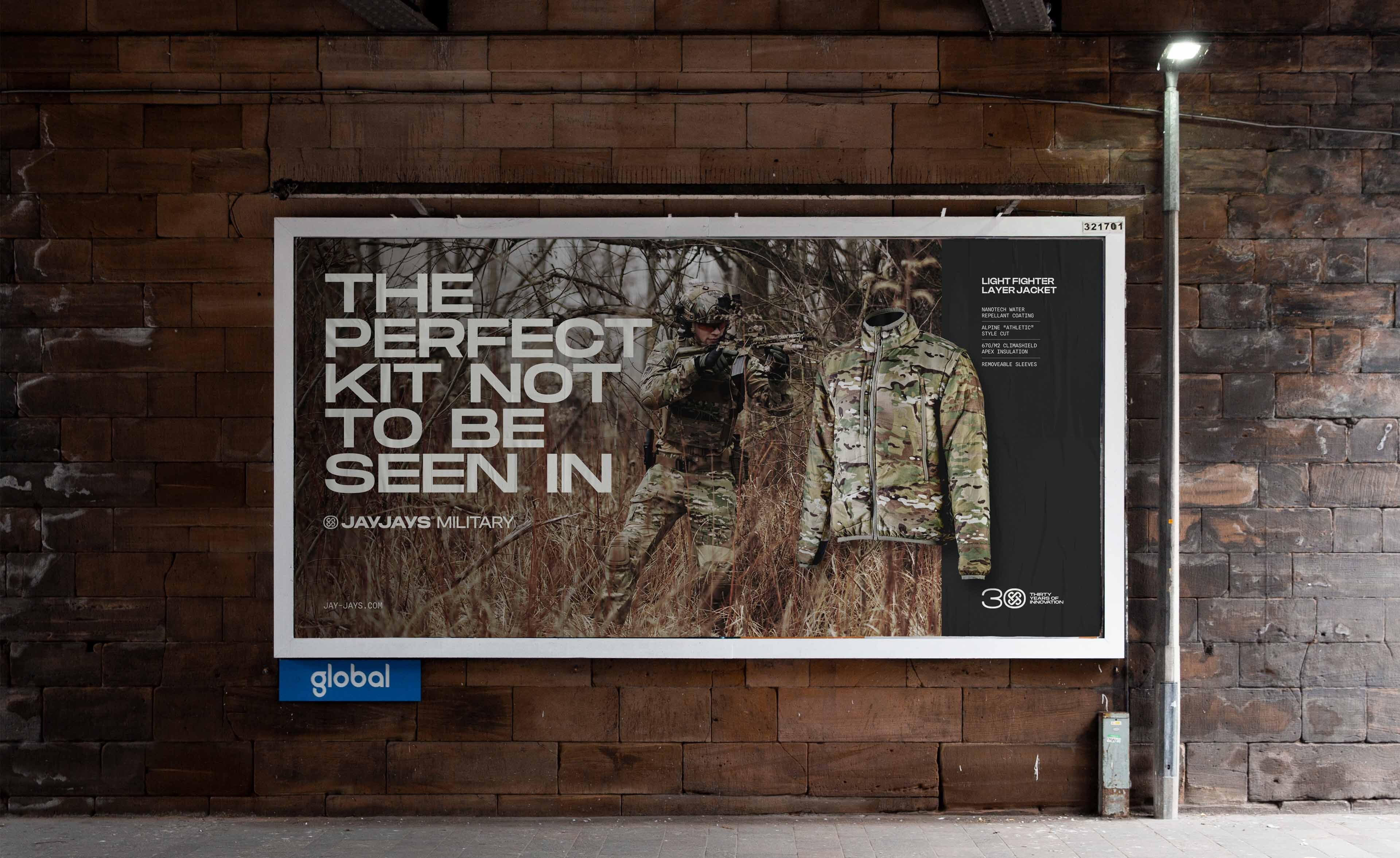
We implemented a new colour system to ensure consistency and create a clear differentiation between the two product lines. We introduced Moss Green to represent the military equipment, for those wanting to blend in, and Flare Orange for its outdoor product line, for customers who want to stand out. This distinctive visual split ensures the brand remains consistent whilst being clearly identifiable by both audiences.


An identity with meaning
We knew from the outset that the new identity had to convey a sense of robustness. It needed to represent the vigorous stress testing and development that JayJays products undergo and the innovation and performance soldiers depend on.
Using Pangram Pangram’s Monument Extended as a foundation, the new wordmark, like the equipment, is strong, robust and built for purpose. It’s designed to be clear at small sizes and when big, it makes a statement.
The identity also had to carry meaning—as with all our brands. An identity that connected with the family and its heritage. A symbol of pride. We boiled down the core function of JayJays products to their simplest form: protection. Protection from the elements, and protection from harm, all of which enable the capacity to protect others.
Brand narrative isn’t something fluffy we add to justify a brand direction. The narrative is the foundation that underpins and informs how the brand takes shape. It’s what makes each brand unique and exciting.
Nathan
Senior Designer, Toward

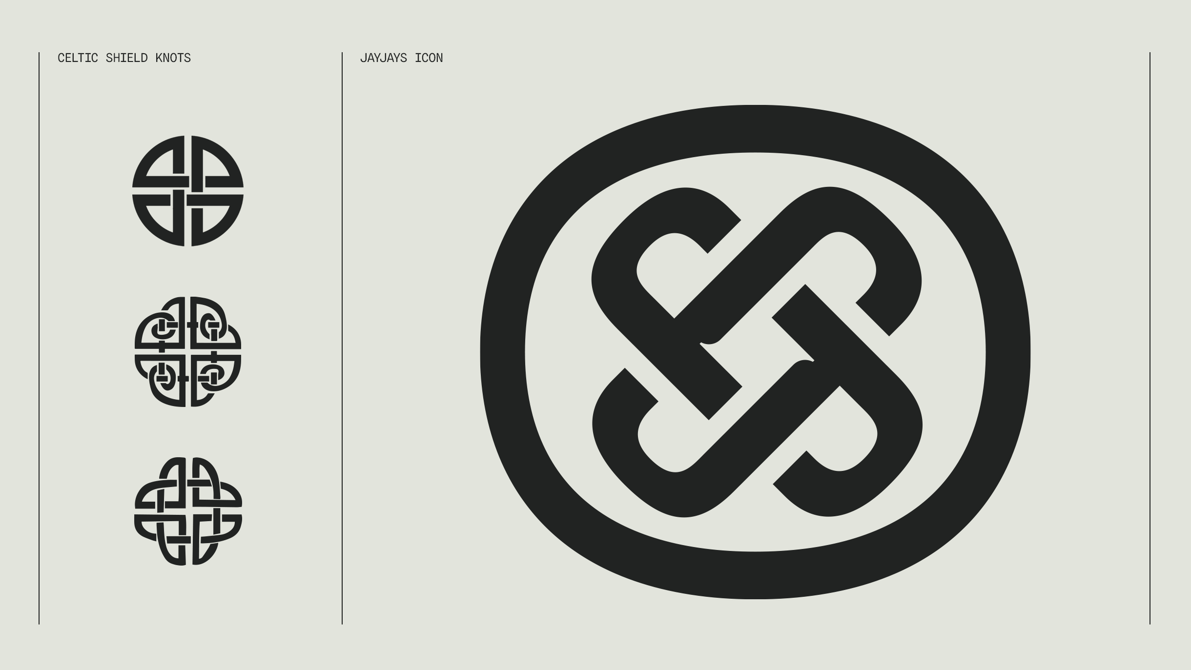
As a nod to its Welsh roots, the Celtic shield knot served as a perfect reference. As a symbol of protection, it also has a historic connection to soldiers who carried it into battle as a talisman. Adapting its form we created an icon comprised of an infinite series of looping Js. The icon and wordmark together represent strength, protection and JayJays’ continual drive for innovation.
Flexible and adaptable
A key part of any identity is making sure it's recognisable, no matter how it's applied. One-size-fits-all is rarely possible, especially when you have a large and varying product range like JayJays. The identity had to be unmistakable whether on jackets, bergans or webbing sets.
There’s a lot of consideration and fine-tuning in crafting an identity, especially one that needs to perform on a technical level whilst also being aesthetically pleasing. It's one of my favourite design challenges.
Previous versions of its logos were dissected and reshuffled and in some cases, a different design was created to allow it to fit its products. To overcome the issue we reviewed all instances of the brand with the JayJays team to identify the problem areas. It became apparent that a single solution wouldn’t be the answer. Instead, we created a flexible logo that avoided having to lose any of the essential parts of the brand. This allowed the logo to adapt to different applications without diluting the brand and avoiding confusion.
An icon for every occasion
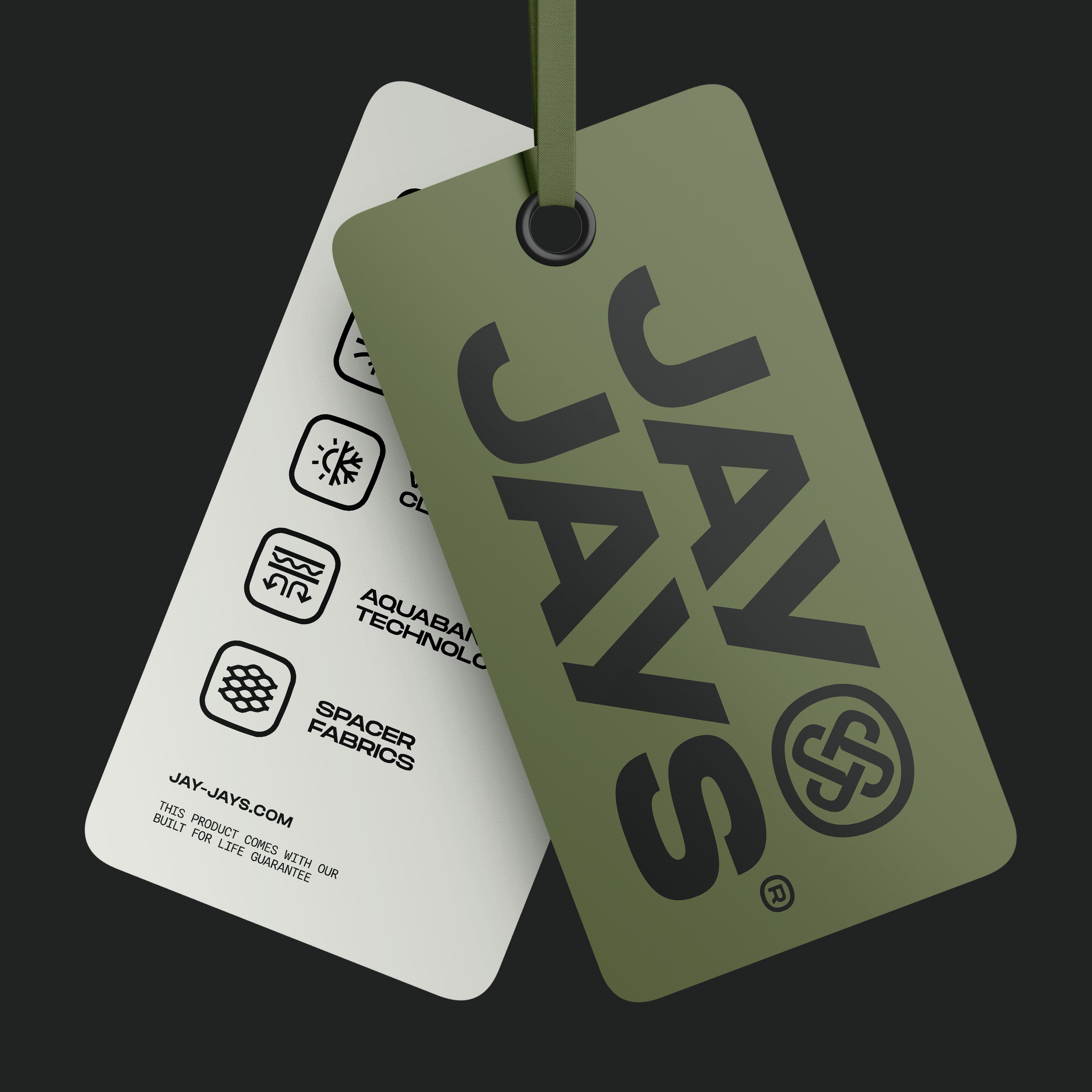
Taking cues from the logo, we designed a set of bespoke icons to communicate product performance features. Used on product tags and datasheets, the bold and simplistic approach reinforces the sense of solidity and robustness that runs throughout the brand.

Typography that makes a statement
The approach to typography echoed the narrative of the brand. It had to be bold and not just to create impact or communicate strength. It’s about conveying confidence. As market leaders, JayJays have amassed a wealth of knowledge and expertise. A confident use of type reinforces this. A voice not to be ignored.
It’s also how you say things that are important. We wanted to create a brand tone and language that supported the confidence and expertise of JayJays as a company and its products. We brought a tone of reassurance to messaging that doesn’t shy away from the faith it has in its products, but at the same time isn’t cocky about it. This approach applies to both audiences allowing JayJays to maintain a unified brand tone without changing its personality.


To encapsulate the ethos of the brand we create a bold and succinct strapline. A statement that reflects the confidence, high quality and the built-for-purpose nature of JayJays and its products — BUILT FOR LIFE. With dual meaning it represents the lifetime guarantee carried by all its products whilst reaffirming the quality and durability that can withstand whatever life throws at them.
A brand with room to grow
We never create brands for now. We create brands for the future. Brands for clients to grow into as they achieve their goals and set new ones. JayJays is no exception. As part of our vision, we explored how the brand could grow and how it can be applied to new products, packaging and new ranges. It’s an important part of the process to help our clients realise their potential and how their new brand can support their vision.


To aid this growth and support the team at JayJays we provided them with a digital design resource. This resource houses its brand assets; usage guides, and photography direction along with examples of how the brand should be applied across digital platforms; packaging, labelling, datasheets and catalogues. Unlike static PDF guidelines, this living resource grows with the client. As the brand develops, new sections can be added allowing it to remain up-to-date and ensuring those using the brand, such as manufacturing partners, always have the correct resources in a single, convenient place.

To read more about the project, and for more examples of the work take a look at our case study.


