
Yondur is the ultimate self-discovery career platform. Using industry-leading neuroscience and psychology techniques, Yondur empowers users to find their ideal career path. In this article, we share how we helped Yondur develop their identity and brand system.
Uncovering Yondur
Yondur was ready with the technology to take the careers market by storm, but they needed a brand to effectively communicate it. Crafting a compelling brand narrative is vital. It engages a target audience and establishes a deeper connection, leading to improved brand understanding and loyalty.
So, this was our first challenge. We carried out a holistic discovery process, to uncover Yondur’s unique narrative and position.
Through workshops and independent research, we:
- Conducted a brand audit
- Scoped out competitor landscape
- Facilitated brand workshops

The previous Yondur brand
Art inspires strategy
Yondur had commissioned a large mural in their office by graffiti artist HazardOne. The mural represented a new direction of thinking for the business. It comprised three key elements—the Yondurer (person), their dreams, and their future. These components served as the foundation for our brand strategy, encompassing purpose, motive and visual language.

The mural and its symbolism had a great influence on our vision for the brand. Yondur prioritises people, champions their future and enhances their chances of finding their dream job. The idea that street art is ever-evolving, just like people, was an interesting angle we began to explore, and was a key feature in our creative process.
The essence of street art was carried through in the colour palette, introducing bold, vibrant tones to exude positive energy and warmth.
Being an art enthusiast, it was awesome to work in a more abstract way. This allowed me to have much more creative freedom with how the brand could look.
Dave
Senior Designer, Toward

Crafting the brand identity
Now we had a vision, it was time to further develop Yondur’s identity. We began a close examination of the 3 core elements of the mural: Purpose, Motive & Expression. These elements form the foundation of the Yondur journey towards realising their dreams, revealing opportunities through learning and personal experiences.
We experimented with various styles and aesthetics, until we achieved a design that seamlessly encapsulated the distinct identity and values of Yondur.
Tying an abstract idea to a visual identity is always a challenge, fortunately with this project the process felt really organic and everything fell into place.
Yondur identity exploration
A marque of many possibilities
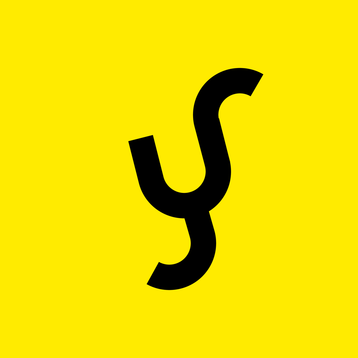
The Yondur marque grew from the idea that the platform reveals pathways of opportunity for its users. Reflecting on this idea, we drew inspiration from Neurogenesis—the process of forming new neurons in the brain. This feature of embryonic development occurs throughout our lives. And in our minds, it was the perfect symbol for Yondur.

The connection was clear, and the brand began to come to life. The marque symbolises the notion of multiple opportunities and potential future pathways that Yondurers can take. With the logo and brand concept developed, we began forming ideas for the wider identity.

Duplicate, duplicate, duplicate
Now we had the brand visual, it was time to develop a design system. At this stage, we experimented with duplicating assets, colours, and collage techniques.
Our goal was to capture the same energy and experience as the mural, but through a digital lens. Through experimentation, we discovered an aesthetic that resonated with the brand, ultimately providing us with the authentic feeling of the Yondur brand.
The design system truly represented the Yondur experience and was flexible enough to allow the brand to grow over time.
Experimentation is hugely important to my process, sometimes the most unexpected outcomes are the most fitting.


Type for people and technology
To help balance the feeling of human and technology, we selected two distinctively different typefaces.
Recolecta by Latinotype serves as the display font with its soft, rounded terminals providing a warm and personable feeling.
Realgar by Emtype Foundry, is used for secondary copy and provides a more technical look, while being complimentary with its round and open letterforms.
In combination, this balanced typographic system helps communicate the emotive people-first side of the brand, as well as the technical user interface.


A relatable voice
Our goal when developing the messaging for the Yondur brand was to create a voice that felt inspiring, uplifting, and positive.
We recognised that job seekers often feel intimidated, shy, or unsure when exploring career opportunities. So, we aimed to create a brand that would energise and guide them towards their goals. The brand statement 'Your Beyond' summarises everything the brand stands for in its simplest form.
Brands that hang their hat on being emotive are my favourite, there’s something about creating mystery and intrigue that feels more meaningful than trying to sell you something.
The Yondur brand serves as a companion, representing the subconscious voice that guides individuals on their journey. The voice helps users navigate the Yondur platform with ease, providing a sense of comfort and guidance as they explore the multitude of career opportunities available to them.


A home for brand assets
So, that’s how we helped Yondur develop their identity and brand system. The next step was empowering the team to bring it to life. To make this transition simple, we developed a digital brand resource for Yondur.
This housed all of the brand elements such as logo use, tone of voice, type, colour and brand application. With this resource, the Yondur team can effectively keep their brand consistent and understood.


We hope you enjoyed this glimpse behind the scenes of our work with Yondur. View the full case study.

