
Introducing STORM+SHELTER, experts in film & video production. This Cardiff-based agency creates thrilling commercials, films and video content to captivate their clients' audiences. We helped amplify their brand presence and built a platform to showcase their exciting work to the world. In this article, we share how, through strategy and design, we helped this agency reach their goals.

Discovery and immersion
To kick off the brand process, we explored the core issues that were preventing STORM+SHELTER from effectively reaching their target audience. Working closely with their team, we conducted a series of brand workshops to:
- Identify the specific needs and wants of their target audience
- Gain an in-depth understanding of their current brand structure and messaging
- Conduct an audit of their competitor landscape
- Uncover key opportunities for enhancing their brand identity
- Develop actionable recommendations for a new and improved brand strategy
The previous brand lacked the confidence that came through in their work, the language and infrastructure wasn't flexible enough to communicate their services to the right audiences.

The problem: Similar audiences, different needs
We identified a fundamental issue at the heart of STORM+SHELTER's brand: a disconnect between their audience's expectations and the perceived value of their work. They needed to effectively communicate their offerings to a diverse range of people, including brands, clients, start-ups, agencies, and directors, all of whom have different needs and expectations when it comes to video content.
As video content can encompass a wide range of formats, from social media explainers to short films, we needed to develop a differentiated brand language that would resonate with each target audience. Our main objective was to ensure that their content production and film & commercial audiences could easily find the content that best suited their needs.
We recognised that there were two audience segments that required different approaches. So, we made the strategic decision to split the STORM+SHELTER brand down the middle, creating two distinct brand personalities that serve each audience segment.


The split personality
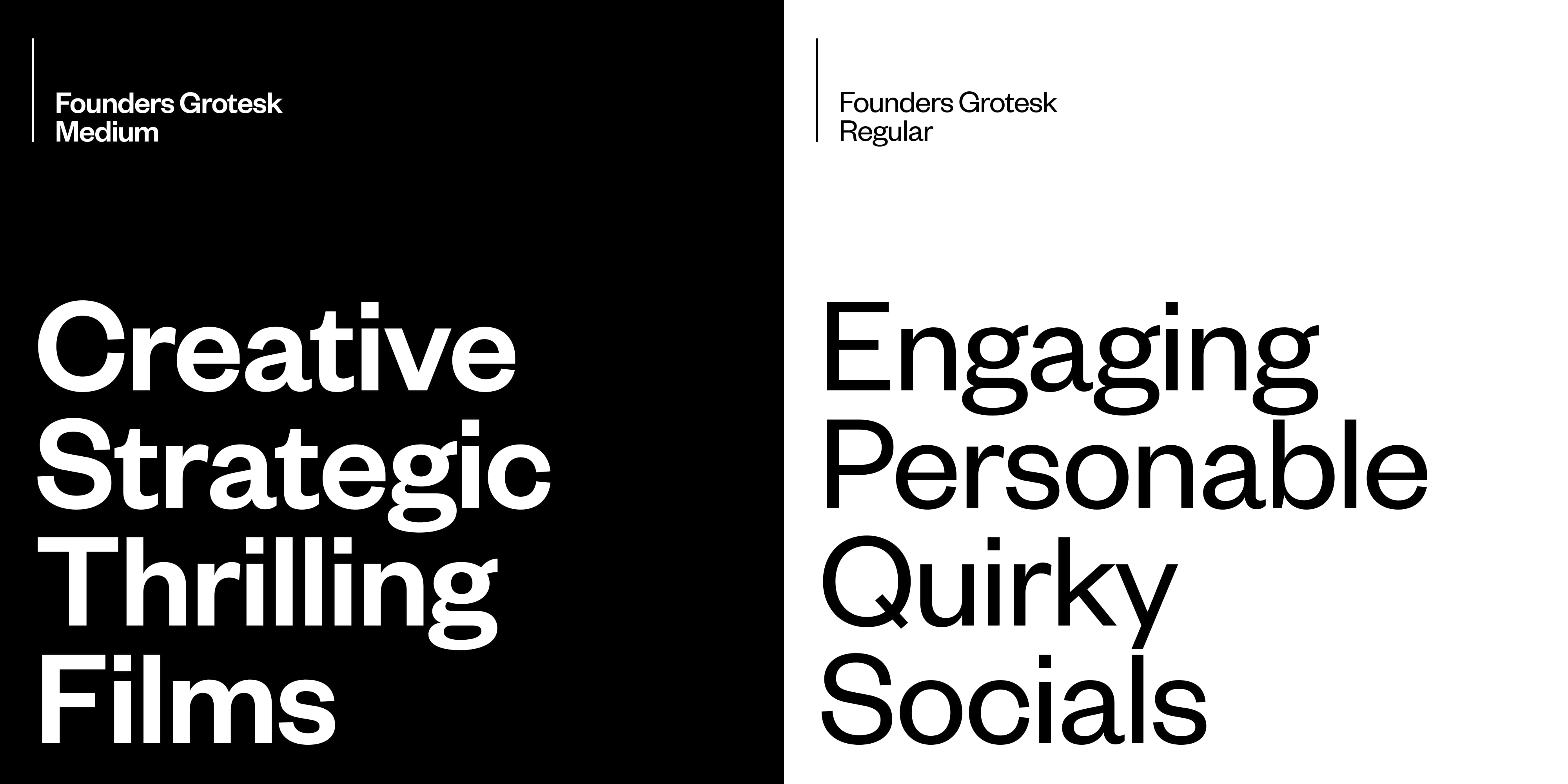
One of the standout features of STORM+SHELTER's existing brand was their unique tone of voice. It was witty, peculiar, unapologetic, and altogether fun. When developing the new brand identity, it was crucial to maintain these distinctive traits while finding a balance that would better suit their target audience.
To achieve this, we carefully evaluated their content hierarchy and messaging, identifying areas where their personable, quirky, and seriously driven sides could be leveraged for maximum impact.
We were able to establish a clear direction for the new brand that leveraged the unique qualities of their name. This evoked a sense of duality between two opposing yet complementary forces: STORM+SHELTER. This direction laid the groundwork for a brand that would resonate with their target audience and set them apart from the competition.
Exploring what we could do with the words STORM + SHELTER was really exciting, it’s very rare you get such an interesting brand name to work with.
Dave
Senior Designer, Toward
To capture this concept, we used Klim Type Foundry’s Founders Grotesk as the headline typeface. It was versatile enough to communicate both personalities, while remaining timeless and not reliant on a specific stylistic aesthetic. To accompany this, we used Display Type’s Tobias as a secondary font to reflect the high quality feel of the commercial personality.
A dual identity
To visually capture the STORM+SHELTER brand we designed a set of icons known as a Rebus. The Rebus effectively communicates the brand in universal form while showcasing the harmonious coexistence of its two distinct personalities in a balanced and equal manner. Using the crosshair inspired ‘plus’ as a centrepiece, this helped bring a focal point to the identity. This formed the basis of the identity which we extended out into a wordmark.

One production, two personalities
A key element that emerged was STORM+SHELTER's "production engine". This essentially meant that their process was scalable yet set in stone, allowing their production experience to remain the same no matter the type of work. This insight was vital to shaping the overall brand direction. It underscored the importance of unifying the quality of their services under one experience, without creating too much differentiation.
This ensured that the brand identity would be cohesive and consistent across all touchpoints, while still allowing for flexibility and adaptability as the brand continues to evolve over time.
The personality of a company should come through what they practise and preach, it’s not as simple as just using a fancy typeface.
Dave
Senior Designer, Toward


A window into their world
As we delved deeper into the STORM+SHELTER brand, we experimented with various visual elements to effectively communicate the transition between their two personalities. After careful consideration, we found that incorporating the 'plus' symbol was the most effective solution.
By placing the 'plus' symbol between the two personalities, we were able to create a mechanism that would seamlessly guide users between the two. This simple yet powerful symbol became a core element of the brand identity, serving as a functional piece of design that would enhance the overall visual appeal of the brand and guide users between the two personalities.


Motion is such an important element of a modern brand, being a production agency it was essential that the STORM+SHELTER brand was built on it.
Dave
Senior Designer, Toward
A new platform to showcase their vibrant work
The website proved to be one of the biggest challenges in the STORM+SHELTER rebranding process. Splitting a website in half can present various complexities, and it was essential to ensure that the user experience remained clear and cohesive. While the brand and its audiences were split into two distinct personalities, we recognised that they still lived together and should not be separated into two websites.


To address this challenge, we conducted a website content workshop with STORM+SHELTER to determine what both types of audiences expected to see across the site. Based on our findings, we devised a solution that allowed both types of work to exist under one roof, while maintaining their distinct personalities.
This approach not only streamlined the user experience, but also ensured that STORM+SHELTER's brand identity remained accessible across all aspects of their online presence.
Using the brand to enhance user experience
As we developed the STORM+SHELTER brand, we placed a strong emphasis on improving the overall user experience of their website. From the moment users open the main menu, to navigating between Commercials and Content, the brand was carefully integrated to ensure a seamless experience.


The 'plus' mechanism played a vital role in achieving this, as it allowed us to clearly divide content and guide users throughout the site. By leveraging the strengths of the brand, we were able to create a user experience that was not only visually appealing, but also highly functional and intuitive.
It was interesting to see what we could do with the brand elements in the browser. I experimented and collaborated with the development team to find unique solutions.
Dave
Senior Designer, Toward
We integrated the STORM+SHELTER's brand identity into every aspect of their online presence, making it easier than ever for users to engage with their content and services.

Unifying their team with a central brand resource
To ensure that the STORM+SHELTER brand could continue to evolve and adapt over time, we developed digital brand guidelines for their team. These guidelines provided a clear understanding of the brand's vision, access to assets, and tools for building and evolving the brand further.
In today's digital landscape, it's crucial for brands to have accessible digital resources that can be easily accessed from anywhere. By creating digital brand guidelines, STORM+SHELTER's team had the flexibility and tools needed to maintain brand consistency and evolve their brand over time, regardless of where they were working from.
We’re extremely excited to see where the STORM+SHELTER brand goes. View the full case study here.

