
SOCS is the market leader in co-curricular management software for schools, providing a seamless experience for the provision of clubs and activities. To maintain their market position, and create a clear differentiation from their competitors, SOCS needed to realign their brand positioning, language, identity and website.
What we did
Discovery
Brand Strategy
Brand Identity
Brand Positioning
Messaging & Language
Website Design
Craft CMS Development
Visit the site
Project Goals
Clarify the offering
Create a distinctive value proposition and simplify a complex and technical offering, clearly articulating it to a non-technical audience.
Use language to engage
Develop language that not only explains the product, but creates an engaging and ownable brand personality that connects.
Modernise the brand identity
Create a new visual language and design system that differentiates SOCS, evolves the logo and sets a new industry standard for design.
A new future-proof website
Design and build a new website that acts as a marketing and sales tool, clearly articulating the offering and providing a foundation for the future.
Results
8.5%
Increase in direct enquiries compared to previous period
43%
Increase in demo bookings compared to previous period
70%
LinkedIn followers increase following new positioning
The whole team has bought into the new position and it has created a real sense of pride in working for SOCS.
Sarah Lee, Head of Marketing
An evolved identity
The ‘spark’ logo mark originally developed by Toward eight years ago has become synonymous with the market leader. To improve it without losing brand equity we evolved the wordmark, simplifying and modernising it, and made subtle changes to the icon colour, size and balance.
Along with the evolution of the main logo, SOCS needed a way to link the brand with their individually marketed software modules. We developed a design system that creates uniform and adaptable logos for each module, promoting SOCS at every touch point of a product.

Clarity through language
Like many tech products, explaining the wide range of features and benefits offered by SOCS in a simple way is difficult. The existing positioning was technical and product-focused. It described the software, rather than sell the outcome and benefits for the customer. SOCS also lacked a central positioning statement to anchor the brand, and act as an overarching message for people to understand.
New customer-focused language is now the core of the new brand, promoting customer benefits over software features. The positioning statement “Transforming co-curricular management for the best school experience” captures the who, what and why, and clearly articulates the value proposition.
A punchy, playfully intelligent tone of voice creates an active but friendly personality, while specifically selected language turns common customer frustrations into positive benefits.

Streamlining the contact process, and our new brand toolkit has really helped with marketing. The insights channel has been a big success in growing our audience on LinkedIn.
Lucy Watkins, Operations Director


While having a great visual identity was important, the key to the success of this work is the language. How the brand now communicates is completely different to the rest of the market.
Tom Lloyd, Creative Director
Standing out from the crowd
A problem faced by many software companies is how to make brand and marketing engaging and impactful, while explaining a technical product. Even with a great looking product, screenshots of functionality and features are too detailed and offer little in the way of context.
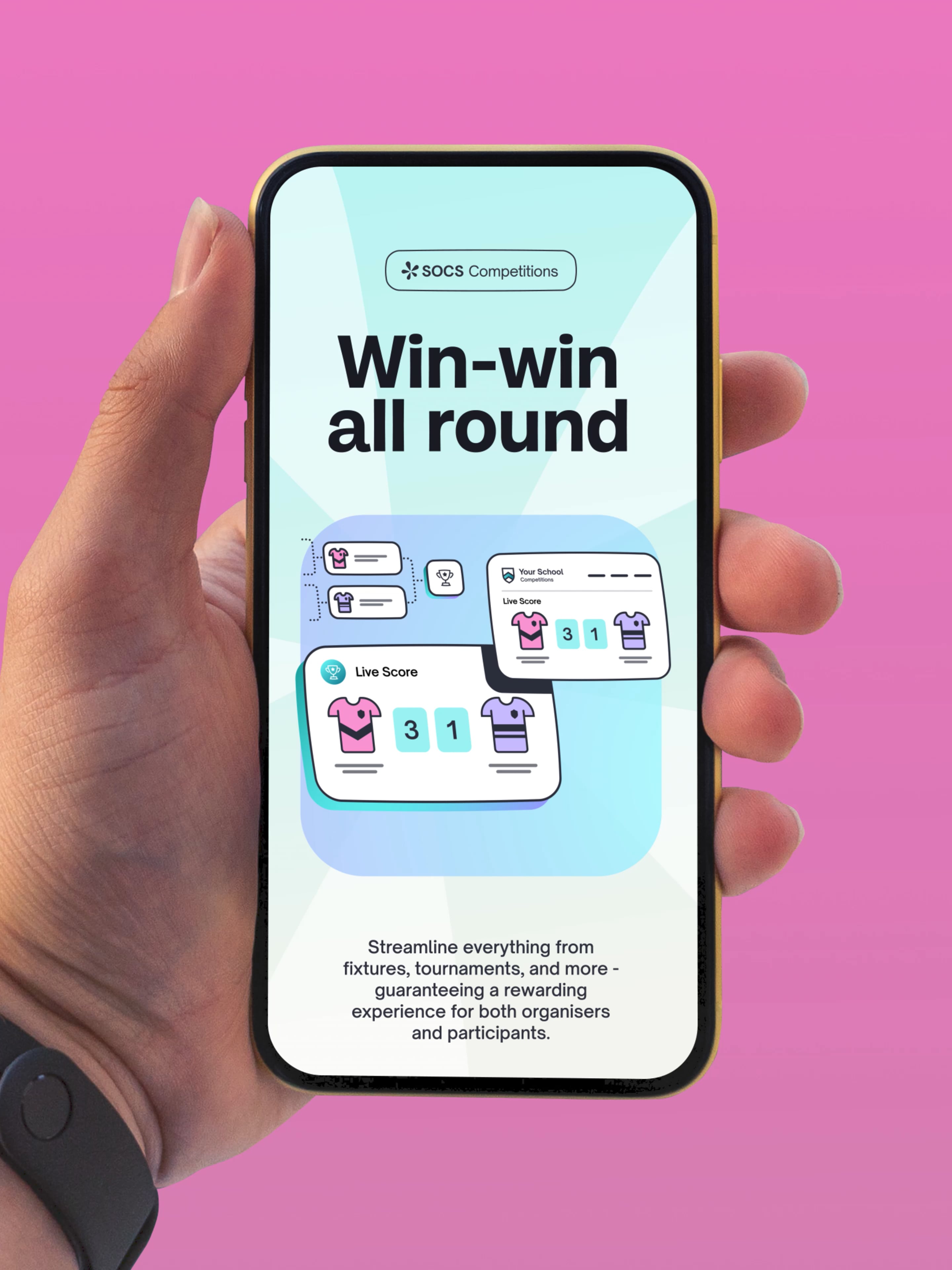
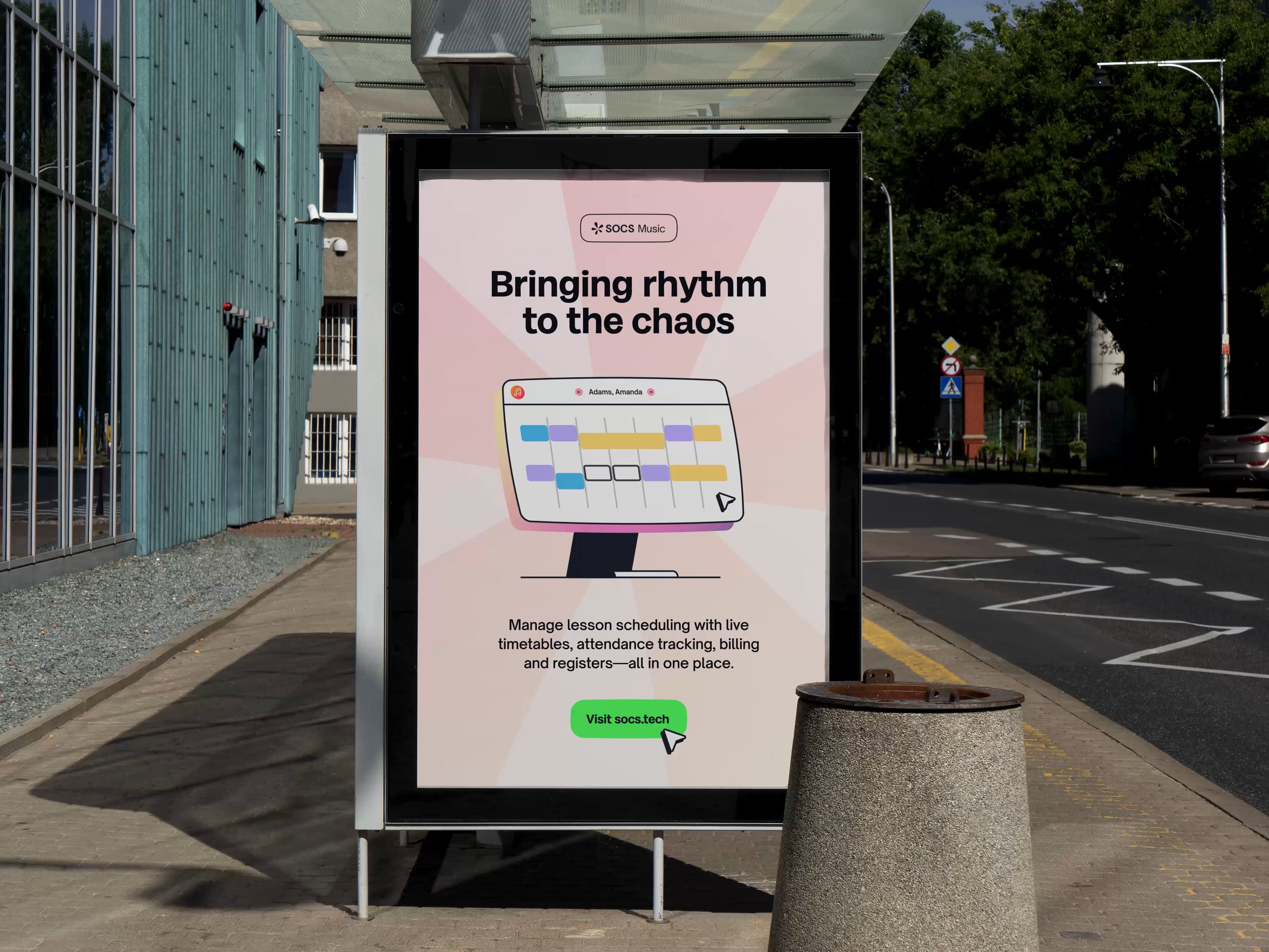
To make SOCS stand apart in the market we looked to inject vibrancy and playfulness into the visual language to work with the messaging and tone of voice. Custom illustrations reflect the simplicity of the software, putting a focus on the benefits of its functionality in a clear and engaging visual style. Additional vibrancy is introduced through a bold, bright colour palette, inspired by the logo.

The core goals of the project were to create clarity and provide solutions for its audience of decision-makers and users. Every element from the brand and language to the illustrations were designed to harmoniously cut through complexity and offer fresh and focused communication.
Nathan Miller, Senior Designer
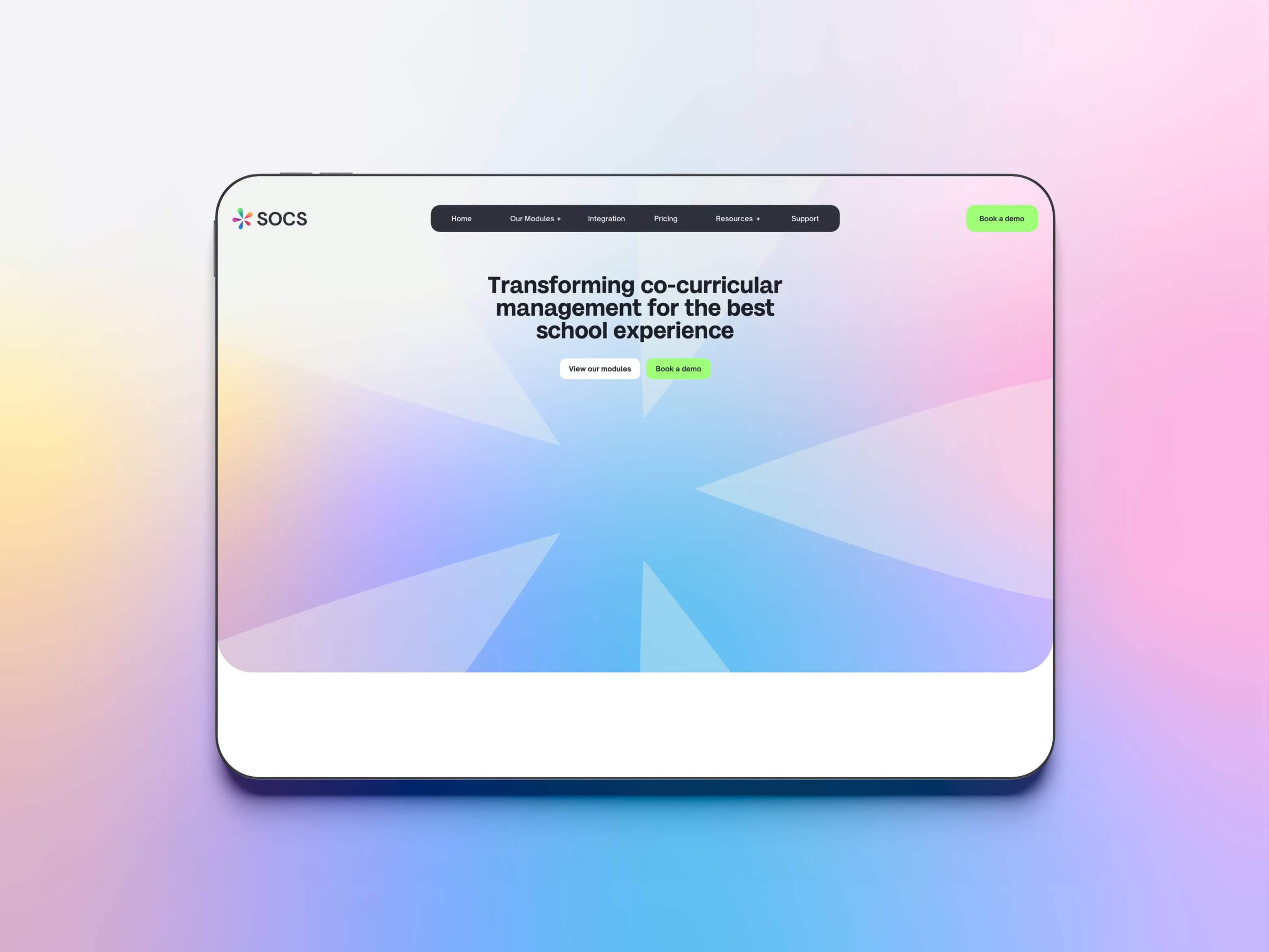
A website built for conversion
The SOCS website is central to the marketing and sales strategy for growing the brand and maintaining its market leading position. The old website suffered from the typical problems found in many software marketing sites. The text content was long-form, and focussed too much on technical capabilities rather than customer benefit. It lacked a distinctive value proposition, and the visual design was lacking.
We designed a new website around the positioning and customer-focused messaging developed during the brand work. The new identity and illustrations help visually communicate the benefits, while the page layouts are designed to break up text into small, more digestible chunks—helping people navigate through the content.

Animation and interactions are designed to reflect the playful design of the brand and bring the website to life, highlighting content. Colour is used to separate content, creating visual themes for each of the software modules.
The website is built on Craft CMS (Content Management System), which provides the team with creative control over existing and future content. A wide range of layouts and components we delivered enable SOCS to build compelling pages for product features, case studies, and marketing landing pages.

The new website has been really easy to use—Craft has been really great. It's easier than Wordpress and I didn’t think I’d say that. It's a really intuitive CMS.
Lucy Watkins, Operations Director

