Brief
As part of an ongoing relationship with CCFC we were tasked with many design challenges such as kit launches, season ticket campaigns, general promotions and branded material around the club. Our aim was to refine and realign their brand so it's built for the future.
Outcome
We developed CCFC's brand assets, typeface, colour palette, art direction and design style to be flexible enough to work across all touch points of the club. Our vision was to create a modern football club which can communicate to the new and old fans simultaneously.

We developed the CCFC brand to fit with the modern landscape of football - adding a new typeface, refined colour palette and rethought branddirection. We built them a digital brand resource which aligned their brand identity so it's used in a much more consistent way.


It was important we captured the image of the club in everything we do. The experience of CCFC was a key aspect of the brand and imagery was the best way to portray the atmosphere. We captured and curated video and image content to help re-energise and represent a modern Cardiff City FC.


We developed a bold, high impact design style that added a boost of movement and energy. Imagery, texture, graphics and motion, combined with the typography brought the brand to life.


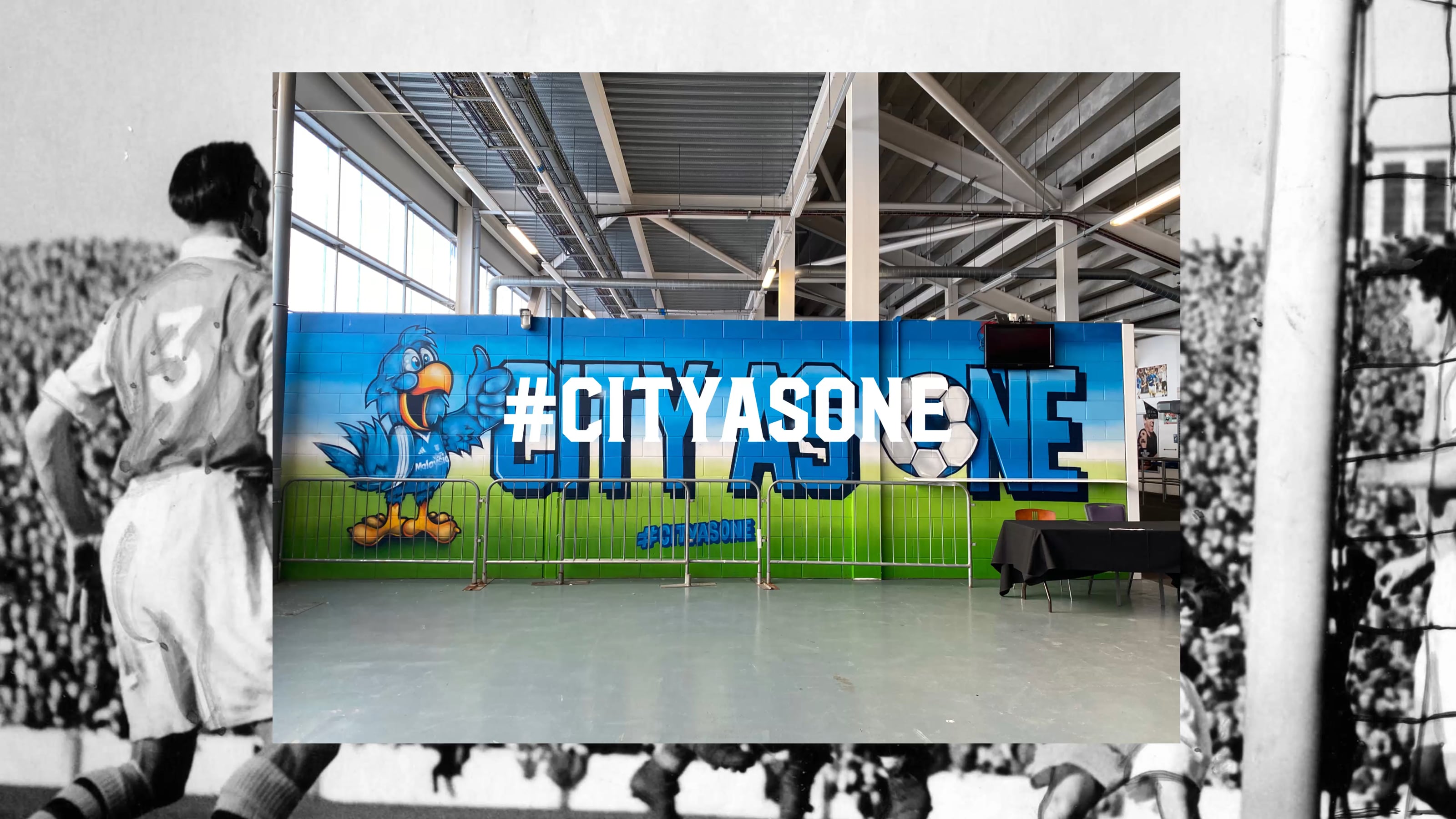
The brand update was rolled out across the club bringing their website, stadium attire, advertisements and tickets all into a consistent brand journey.


We helped roll out the brand into all areas of the club including the Bluebirds Experiences - a range of unique Cardiff City inspired experiences for children, young people and families.


We created a sub identity which helped package up the Cardiff City FC premium offering. Utilising the Bluebird as an icon of elegance and bringing it a palette that help differentiate the value of the offering without feeling distant from the core brand.


