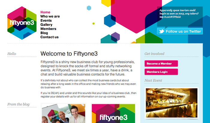
If you follow us on Twitter or have read our blog before, you may have heard us talk about Fiftyone3, a shiny new business club that we created the brand identity for and help to set up. Click here to read our previous post about the branding ›
Last week we finished the next phase of the project which was the website. Having already created a brand identity and applied it to banners and printed materials we had a good starting point for the website design and used the bright colours and hexagon shapes from the logo throughout the site.
It's a relatively small website but acts as a great resource for people in between the 6 events that happen throughout the year. As well explaining the reasons for the club and the story behind the name, people can also register for events and add themselves to the members directory. We also added a blog and gallery so we could share information about the previous events.
The site was built using WordPress and the event registration function is managed by the Event Espresso plugin. The systems allow members to sign up to the site, create a profile for the member directory and register and pay for events online.
 Members can add themselves to the members directory. Nothing like a bit of self promotion!
In line with our overall strategy for producing multi platform websites, the website is responsive, meaning it changes form to be perfectly displayed on screens of all sizes, from desktop to mobile. We'll be writing a lot more about this in the coming months so keep an eye on our blog, follow us on Twitter or sign up to our newsletter to keep up to date!
Visit www.fiftyone3.com to check it out for yourself and let us know what you think in the comments!


