We often refer to the 'Toward Way'. To us, that's the way we work, how we deal with clients, our tone, personality and agency culture. Fortunately, most people get it and they are the ones we have long lasting relationships with.
Zoosme came to us a few months ago as they liked the Toward Way, and wanted us to inject some life and personality into their brand which was, by their own admission bland and uninspiring.
Here's a little background. Zoosme was found in 2011 to help SME's manage their businesses. From payroll and HR, through to marketing and accounts, Zoosme do all the tasks that business owners don't want to do, allowing them to focus on what they are good at.

The old Zoosme logo and website before the redesign
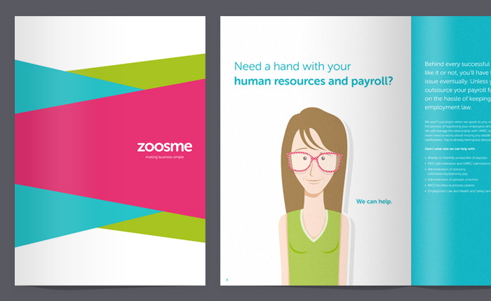
Being from an accountancy background, Zoosme founder Murray wanted to step away from typical formal and corporate looking marketing materials and make a dent in the market with their new approach to these services. Fresh, vibrant and brimming with personality were the key objectives for the brand refresh, stationery, website and brochure.

New Zoosme brochure cover and spread
The existing logo was the word Zoosme with the two o's doubling as heads to businessmen characters. There was no real personality, the colour pallet consisted purely of blue, white and grey resulting in a bland and clinical look. We considered keeping some sort of businessman type character but after much tinkering we decided to keep it simple, we would simply focus on the word Zoosme and communicate the personality through the use of bold colours, illustration and the content.
We also provided copywriting services. Using the existing content as a starting point we developed the tone of voice based on research we carried out with Zoosme and also tweaked it so it was consistent and authentic.

New Zoosme homepage featuring custom illustrations

New Zoosme website featuring custom illustrations of each team member
Determined to avoid cringeworthy stock imagery, we created bespoke illustrations that bring the site to life and really hammer home the point that Zoosme aren't your typical accountants.
The website itself is relatively small, static with a WordPress blog. Again the colour and illustrations share the personality. This translated to the brochure too which also takes a big step forward from your typical corporate brochure.

As we wrote the copy for the site, we could created really relevant illustrations
Working with a client that understood us really made a difference and that sentiment was felt from the client too as Murray explains:
"The Toward team produced top quality work in the form of a website and corporate brochure for Zoosme. The bespoke design work complimented the brand perfectly and the team demonstrated a great understanding of what we were trying to achieve. Working with Toward was extremely easy and stress free as they know how to manage and deliver projects and respond efficiently to technical changes. But most of all, working with Toward on this project was fun."
Thanks Murray! So Zoosme came to us to experience the Toward Way and we are proud to have played such a big part in creating the Zoosme Way.
You can see the website here www.zoosme.com and as always, we'd love to know what you think in the comments below.

