Alt text is a fallback description for an image online. If you are a sighted user, you might have seen this if an image hasn’t loaded for you. If you use assistive technology to use the web, this text is essential to understand the subject, or meaning, of the image.
Alt text is added to images in HTML code by adding an alt attribute to an image tag.
<img src="/path/to/img.jpg" alt="Description of the image">
It is required (usually)
You might ask “Do I need to use alt text?”. For example, you could presume that unsighted users might not be interested in the images. However often images are essential not only as part of the content, but maybe also to fully understand the tone or context of a page (more on this later). Therefore, it’s essential to add alt text to every image tag.
There are occasions when an image does not require alt text. If an image is purely decorative you can omit the alt text by leaving the alt attribute empty:
<img src="/path/to/decorative/img.jpg" alt="">
In my experience, this is pretty rare these days. Decorative images can normally be achieved by using CSS.
It’s almost always required. How do you write good alt text? I’ll explain how we approach it at Toward using some of our legendary* Instagram images:
*not a guarantee
Don’t tell people it’s an image
It’s redundant to tell people that the image is an image. Take the following image as an example:

It would be pointless me saying “Image of Tom off of Toward looking lovingly at his new MacBook (awww)”. A screen reader would announce that it was an image anyway. Therefore, we can just describe what is going on in the image:
<img src="/tom.jpg" alt="Tom off of Toward looking lovingly at his new MacBook (awww)">
Describe the image concisely
That can be easier said than done. How much detail should you go into? For example:

So for the alt text here, we could say “Mike Jordan’s head and shoulders. He has a beard and is wearing a pink sweatshirt and a green, woolly bonnet designed with knitted eyes protruding from the top to make the wearer look like a frog. He is pulling a funny face with cross-eyes, in his kitchen which has white cabinets and dark grey tiles laid in a brickwork pattern…”
This alt text (and I could go on) is very descriptive, but it’s probably not helping the user understand what is going on because it lacks focus. Clearly the gist of this image is Mike, the bonnet, and the funny face. Therefore a better alt text might be “Mike Jordan wearing a green knitted bonnet that has knitted eyes to look like a frog. He is pulling a silly face.”
There is no hard character limit for alt text. It should be as long as it needs to be, but as concise as possible. Imagine using a screen reader and having it read out a very detailed and complex description of an image. It would slow down your reading and understanding of the content.
Images with text
If an image has text, it’s important to summarise that. For short text, that could mean adding the text verbatim. For longer text, it might be better to summarise (providing the user can get a full transcript if necessary).
Take the following image:

Compare that to this:

In this example, it’s probably not important for the user to know exactly what the text is (technically a sighted user could zoom in and try and read the small print for example but it’s unlikely). Instead we should consider the content and what we want the user to understand from it. For example: “A construction hoarding design mock-up for Vortex. The billboard featuring a marketing message about how they empower organisations to reduce pollution through environmental data collection”
Use proper sentences and casing
Another thing to consider is using proper sentence structure, punctuation, and casing. It’s fine to write the alt text in the same tone of voice as the website. You don’t need to do anything too robotic or serious (unless that’s the right tone for the site or content). Avoid using UPPERCASE unless it’s for an abbreviation, acronym, or initialism.

For example, the alt text for the above would be “We’re looking for a PHP web developer. Help us build great websites like this… (swipe for more)”. Here we make sure we only use UPPERCASE for PHP and write everything else in regular sentence case. We can also provide a fallback for the arrow indicator, which is to tell the user to swipe to see the examples.
Complex images
For items with more complex information, such as charts or maps or diagrams you often won’t be able to detail the full information in the alt text. It is often better to provide the overall trend or meaning of the image, rather than try to include everything in the alt text. In these instances, it would be better to include a link to more information in an image caption, or within the supporting content on the page. Take the following image:

Rather than try to describe this map in detail, we can just say “A screenshot of an analytics dashboard in Shopify. It shows a map of the UK displaying the users on the website during a sale. There were 507 users at the time of the photo, and a daily total of 1079”. For context, we also explain the photo is a screenshot, and also it is an analytics dashboard in Shopify.
Understand the context
Now we get to the nuanced complex stuff. Sometimes the alt text is going to be different depending on the context of the image, or what the article is writing about. A simple example could be the following:

Now if the context of the content around this image was about Mike and how he misses the Supergreen in Wagamama, we could alt tag this as “Mike Jordan in Wagamama with a Supergreen (RIP)”. However, if what this image (and content) was actually about was how we were in Wagamama and all started colouring in the placemats, the alt tag should be “Mike Jordan colouring in the placemat at Wagamama”. It’s not important to mention the Supergreen (RIP) because it’s not relevant to the user.
To get a little meta, this post that you are reading has given me a bit of a headache, because the context of these images is that I am illustrating nuanced alt text examples, I need to give them different alt text than what I’m describing. For example the above image could have the alt text “Mike in Wagamama, colouring in a placemat with a supergreen next to him”. I need to include both parts because otherwise it won’t make sense in the context of the article.
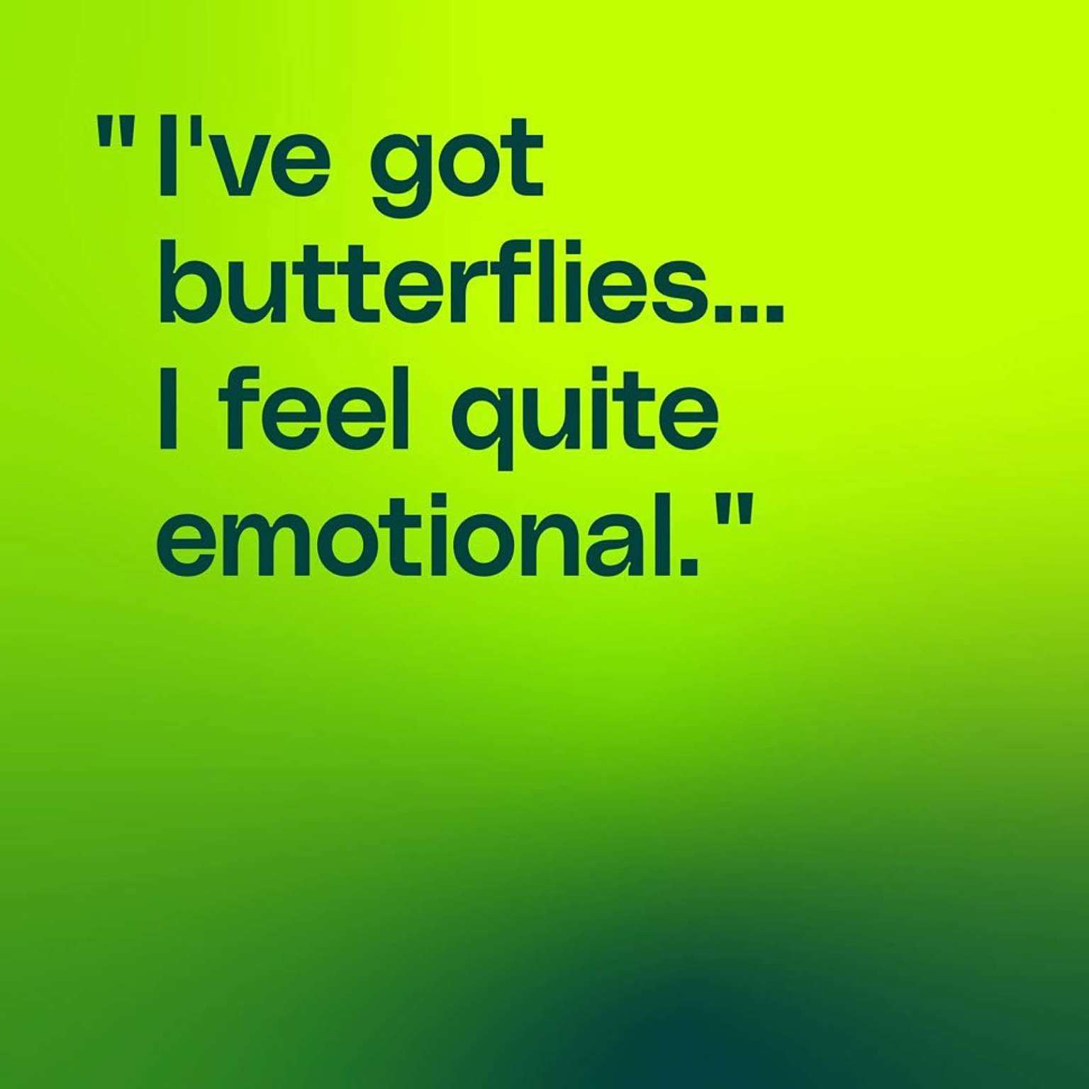
Further, the alt text for the thumbnail was almost alt text inception. It did raise an interesting point though, if the image is of an emoji, can you use emoji in the alt text? I couldn't find a definitive answer, but did read advice not to replace text with emoji which I assume would also apply to alt text.
Note: Emoji have descriptive names and meanings so are accessible, but that relies on you doing your bit when using them. Here's a good post that explains how to use emoji accessibly.
Emotion
The final consideration we’ll look at is what the emotional impact of the image is and how you can convey that through alt text. This is going to have quite a bit of crossover with context, as the context of an image will obviously have an impact on the emotional impact. An image of a cuddly toy in a post about Christmas, will obviously have a different effect in a post about a car accident. It’s common for visuals to play with these emotions, for example here is a campaign we did a few years back to warn of the dangers of drink driving:

Leaving the text to one side for a moment, the alt text here would be tricky. The image is deliberately sad. It uses cultural understanding by playing on children’s book illustrations and the juxtaposition of that displayed in a muted and depressing way. When combined with the text it makes for a powerful image. How do we do this justice through alt text?
Even by describing the image, we could completely change the context. Imagine if the alt text read “A christmas tree on christmas morning. There are 2 full stockings for Mum and Amy, and 2 empty stockings for Dad and Sam.” This could be interpreted as Sam and Dad have opened their stockings early. That’s a completely different campaign.
You could refer to the style of the image, the muted and depressing colour and style (although consider that your emotional understanding of colour might be different for someone who has never seen colour), but the clear signifier in the image for me is the bear.
For me the alt text that works would be “An ink and watercolour children’s book illustration of a christmas tree on Chrstmas morning. The colours are muted and grey. There are 4 stockings, 2 full (Mum, and Amy) and 2 empty (Dad and Sam). A toy bear looks sad”.
Obviously, if the text was part of the image, we could also include this. It makes the alt text quite long, but I’m comfortable that the entire thing is required to fully understand the image and context.
Conclusion
What makes good alt text? As with all things web design and development “it depends”. Something I’m beginning to understand with accessibility is that often, it’s as nuanced and subjective as other areas of web design and development. Alt text is a nuanced subject that can get quite complicated. It’s really important to have a go though. Some of the examples above (particularly the last one) are deliberately tricky. Most of the time, alt text can be quite simple to write, sometimes even fun to think about.

Further reading
Some further resources on alt text which have helped me
Writing Great Alt Text - Emotion Matters by Jake Archibald
Twitter’s guide to writing great alt text
I’d love for you to get back to me with your opinions on this post and whether it is helpful, or whether we’re doing it wrong. Message us @towardstudio on Twitter and Instagram.

