Brief
Llanerch Vineyard Hotel has undergone a remarkable transformation, outgrowing its current brand and website that no longer showcased its true offering. It needed an evolution—an amplified brand and a website that truly celebrated the essence of everything that makes Llanerch truly exceptional.
Outcome
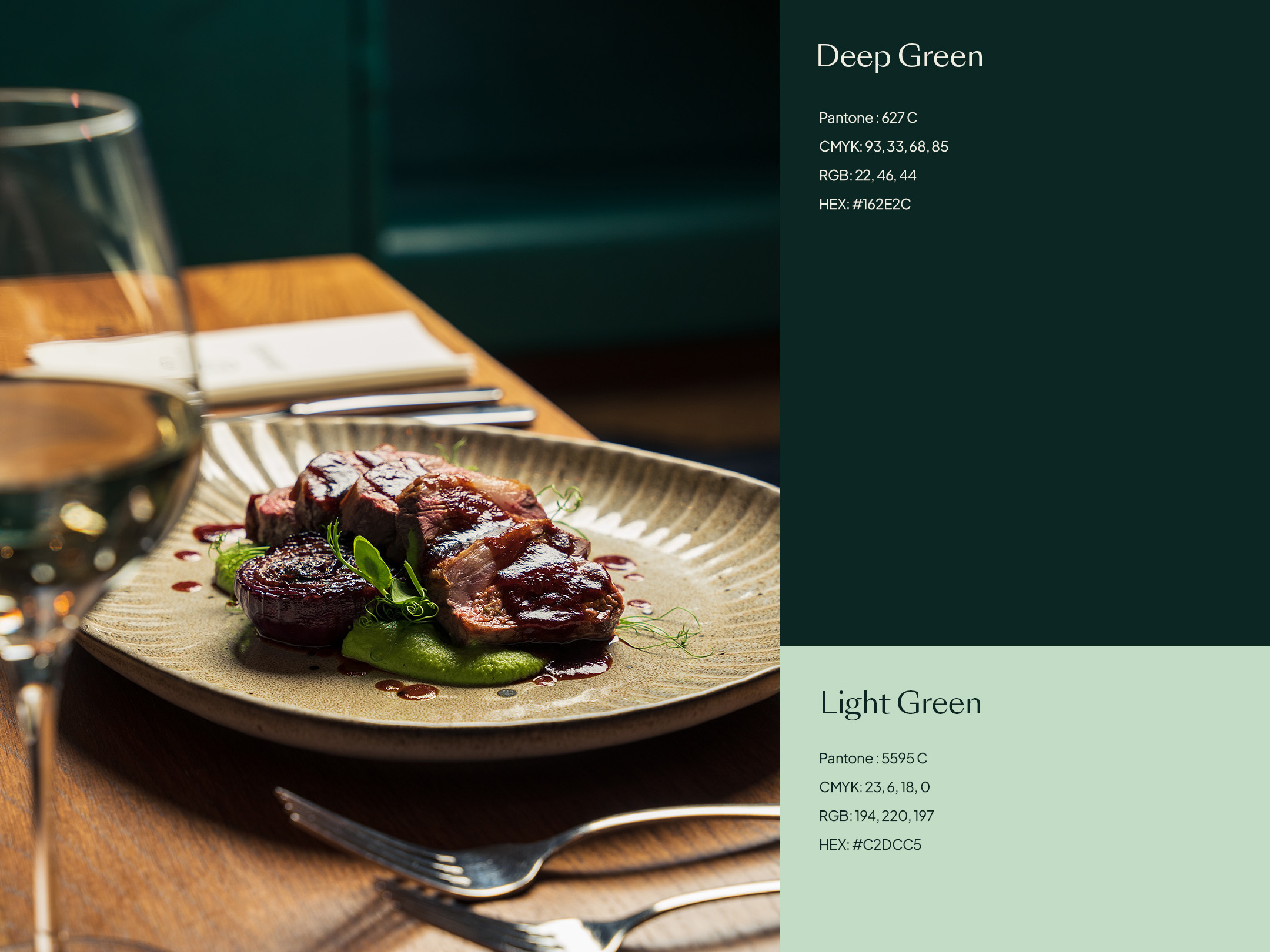
Embracing its newly refurbished interior, we created a refreshed and extended colour palette to capture its sophistication and luxuriousness. Along with its wider offering, we put a spotlight on what makes Llanerch great—its talented people and the exceptional producers who craft the immersive Llanerch experience.
We wanted to create a brand experience that connected with its physical surroundings. Echoing the hotel's interior, the new colour palette creates a feeling of familiarity and a greater sense of quality.


Llanerch embraces the beauty of each season with its captivating floral decorations and exquisite culinary creations. To visually capture this, we introduced an expanded colour palette. By doing so, the brand can proudly embody the changing seasons and maintain a vibrant sense of freshness.


Llanerch isn’t just one thing or one offering. It brings together a picturesque vineyard setting, an award-winning hotel, award-winning food and wine along with a stunning wedding venue.
What makes Llanerch truly exceptional can be easy to overlook. We put a spotlight on everything that goes into making it an award-winner. Telling a story from producer to plate, from vine to wine. Bringing together the best of everything—enjoyed together.


To complement the brand evolution we chose Swiss Typefaces’ SangBleu Sunrise and Kingdom Italic fonts. Sunrise provides a balanced mix of sans and serif to create a modern but classical type system. Kingdom Italic adds emphasis to its messaging, drawing attention to the unique elements that set Llanerch apart.


As the main touch point for its customers, the website had to champion Llanerch. Using its incredible photography and beautifully shot videos, we created an immersive experience to entice people into discovering Llanerch for themselves.


We applied smooth and subtle motion to create a graceful website experience. Photographs that glide as you scroll, soft loading content and colours that blend together as you move from one section to another, making everything flow without sharp breaks.

It's been a pleasure to work with Llanerch again on a major repositioning of their brand, five years after we first worked together. The response to the website has already been excellent with all major metrics seeing improvements. If you'd like to talk to us about evolving your brand and website, get in touch.
Video credit: Clear Cut Social


