Brief
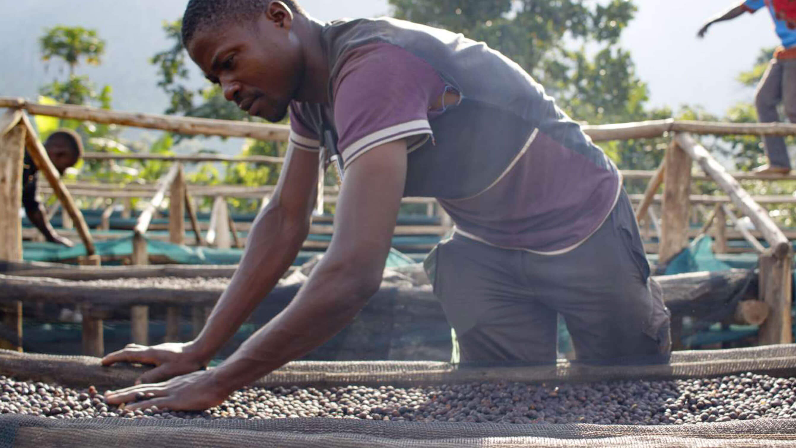
Manumit is a coffee brand, on a mission to stop slavery. Beans sourced from slavery-free farms, roasted by survivors of slavery, on the road to a better life.
Outcome
We created a bold new brand identity, and launched a new ecommerce store so they can take their coffee to the masses.
Using the existing logo as a starting point, we redefined and refreshed the whole brand, introducing a vibrant, but natural colour palette.


The headline typography is rustic and weighty, balanced with a mono typeface which feels more personal.

To help Manumit tell their story we created brand messages which are used throughout the store, promoting the mission.


The old site was built with WordPress, using WooCommerce for the shop. Manumit needed a more sophisticated and powerful ecommerce store, without losing the ability to tell their story. We developed the new store on Shopify, which gives the team the power and flexibility they need.

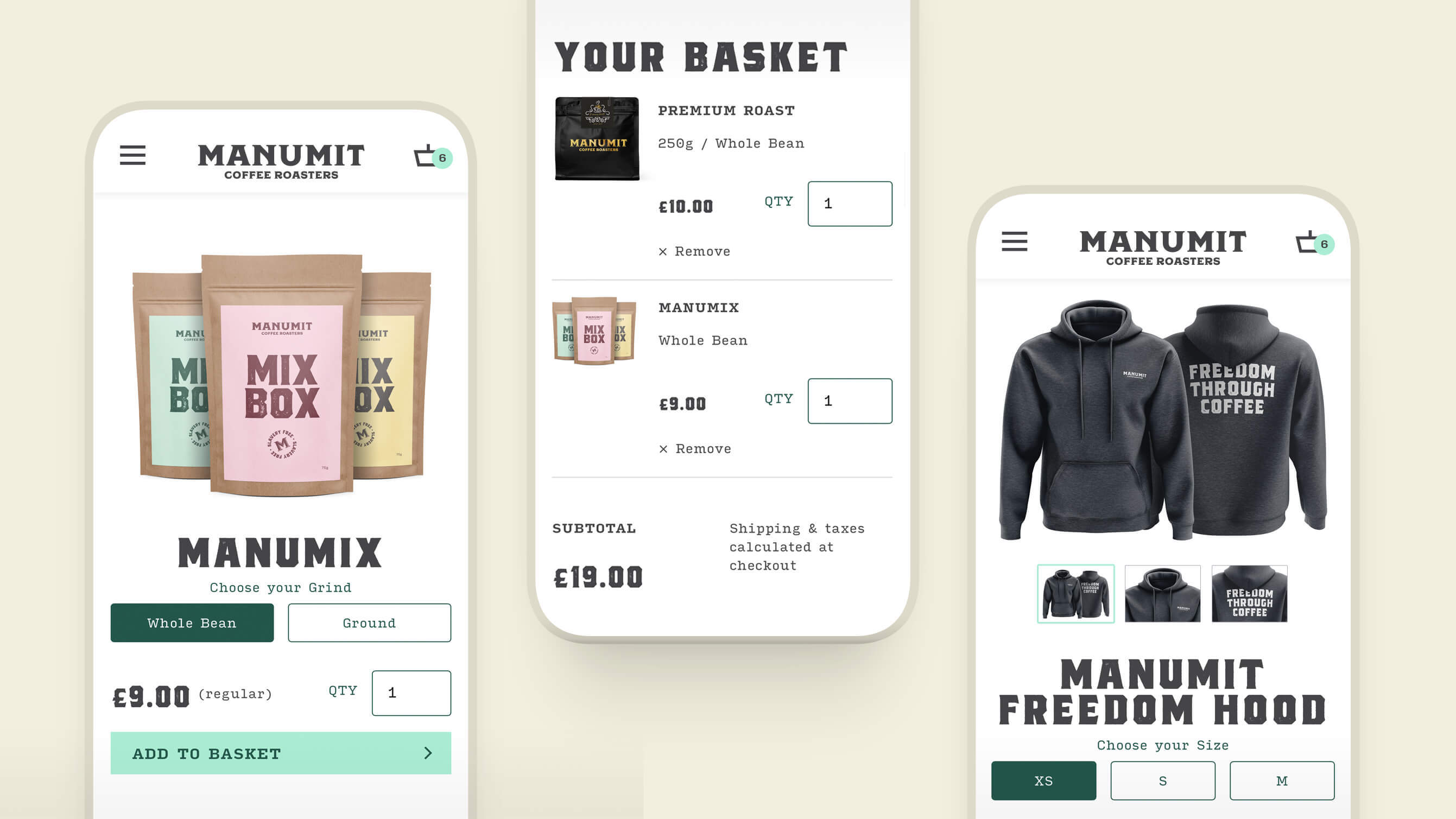
The core audiences for the store are retail customers looking to buy one-off bags and regular subscriptions, and organisations buying wholesale. Based on our own experience of e-commerce stores and analytical data, we designed the website to be optimised for mobile use, while ensuing it looks equally great on desktop.

Finger friendly buttons for selecting options makes for a much improved mobile experience.

Our experience with Toward has been extremely positive. From the initial conversation, all the way through to launch they have demonstrated great professionalism and quality of work.
Dai Hankey
Director

There’s no point in having a great looking online store if the product packaging lets it down. We created the product imagery, and worked with Manumit to redesign some of their coffee packaging and merchandise. Now the products can be the stars of the show.


We now have a great new website with a fresh and engaging look, that offers a great experience for our customers. Thank you Toward—you guys rock!
Dai Hankey
Director


