Brief
The design and production of military-grade equipment is a competitive market. Genuine JayJays, veterans in innovative kit solutions, needed to overhaul its brand and shift its perception for a worldwide audience.
Results
We stripped back their name and created a robust and impactful visual identity that champions their products, showcases their innovation and includes flexibility to diversify its future offering.

Taking inspiration from the Celtic shield knot—once carried into battle by soldiers—we created an icon of infinite looping Js as a symbol of protection paired with a robust, custom wordmark.
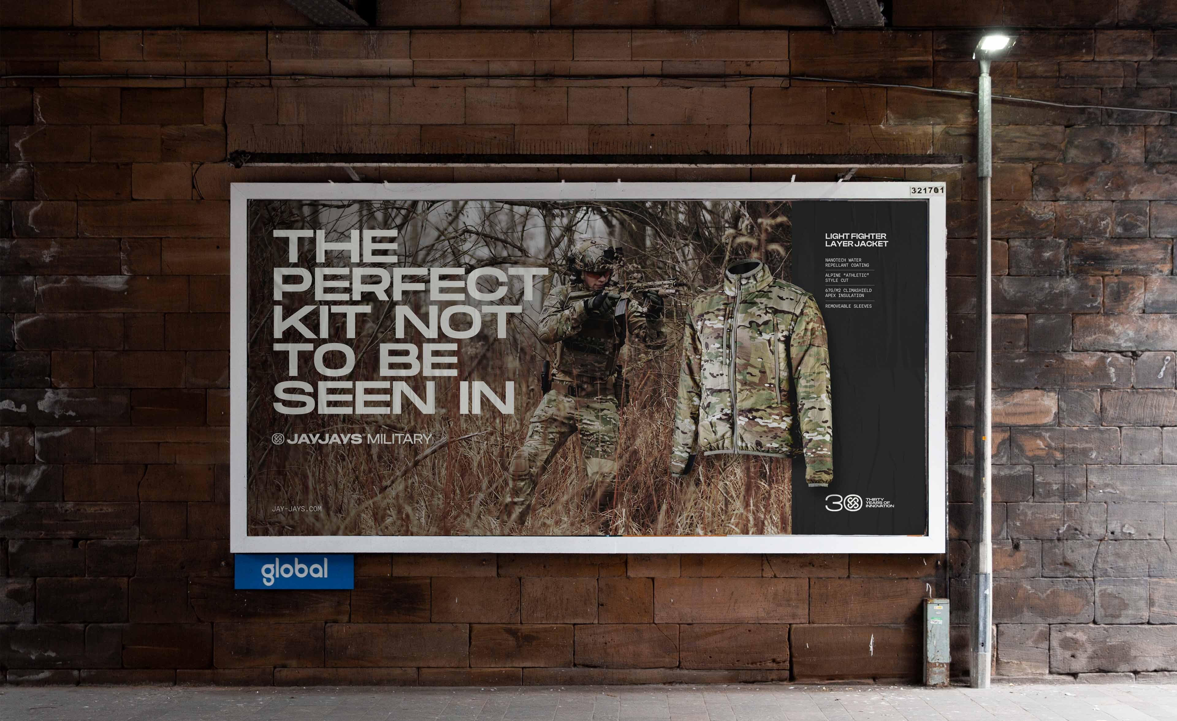
With a range of equipment in varying shapes and sizes, the flexibility of JayJay's identity was essential. No matter the application, it needed to flex, maintaining impact without losing its character.


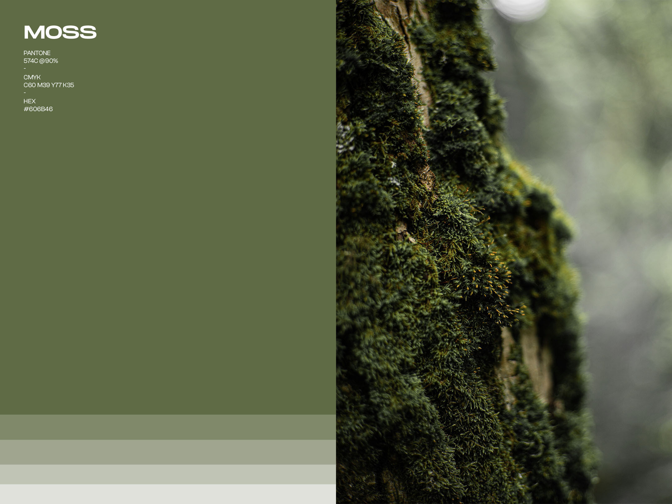
Part of the brand challenge included how it would connect to wider, non-military audiences when diversifying into the outdoors marketplace. It had to clearly segment its offering without losing its visual identity. So, a split colour palette was created to differentiate between the two product lines: Moss—for blending in—and Flare, a bright orange for standing out.


To effectively communicate the unique performance features of their products, we created a bespoke suite of icons designed to echo the solidity of the logo and brand typography.


