We bought into the idea. We’ve felt the same pain—hiring staff for Toward is a difficult process and recruiters are generally very expensive and lack the up-to-date knowledge of what we’re looking for.
Research
Digital Profile needed a brand identity and visual direction that would set it apart from competitors. A brand that would connect with its audience, create wonder and provide a foundation to build on.

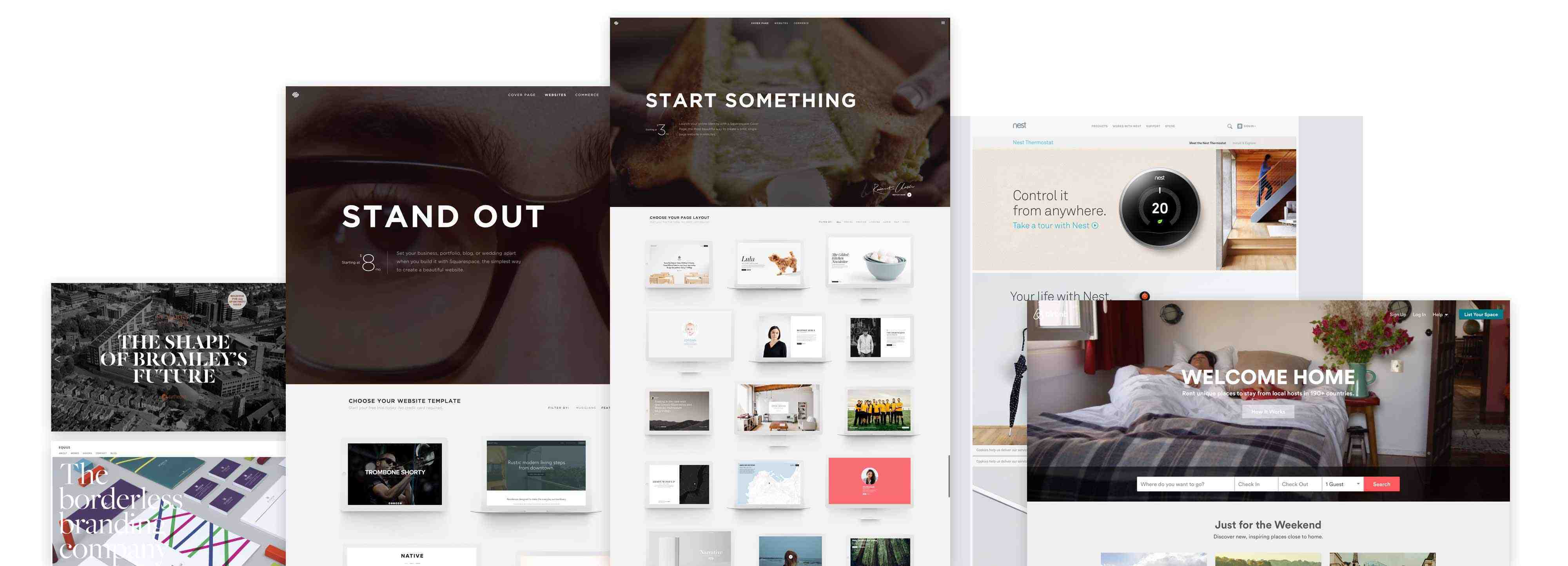
In early discovery meetings we found out what the team liked—a look that’s very much in trend right now: large photography, bold typography against a crisp and clean background.

The trouble with this look is that it’s so ubiquitous, every other website you visit follows the same theme. One benefit of being the target audience was that we could anticipate how people would react, and we knew our industry would need something different to break through the noise.
Logo
The first part of the puzzle was to develop a simple, authentically digital logo. We designed a deliberately understated wordmark that incorporates an animated underscore and set out some initial guidelines for use.

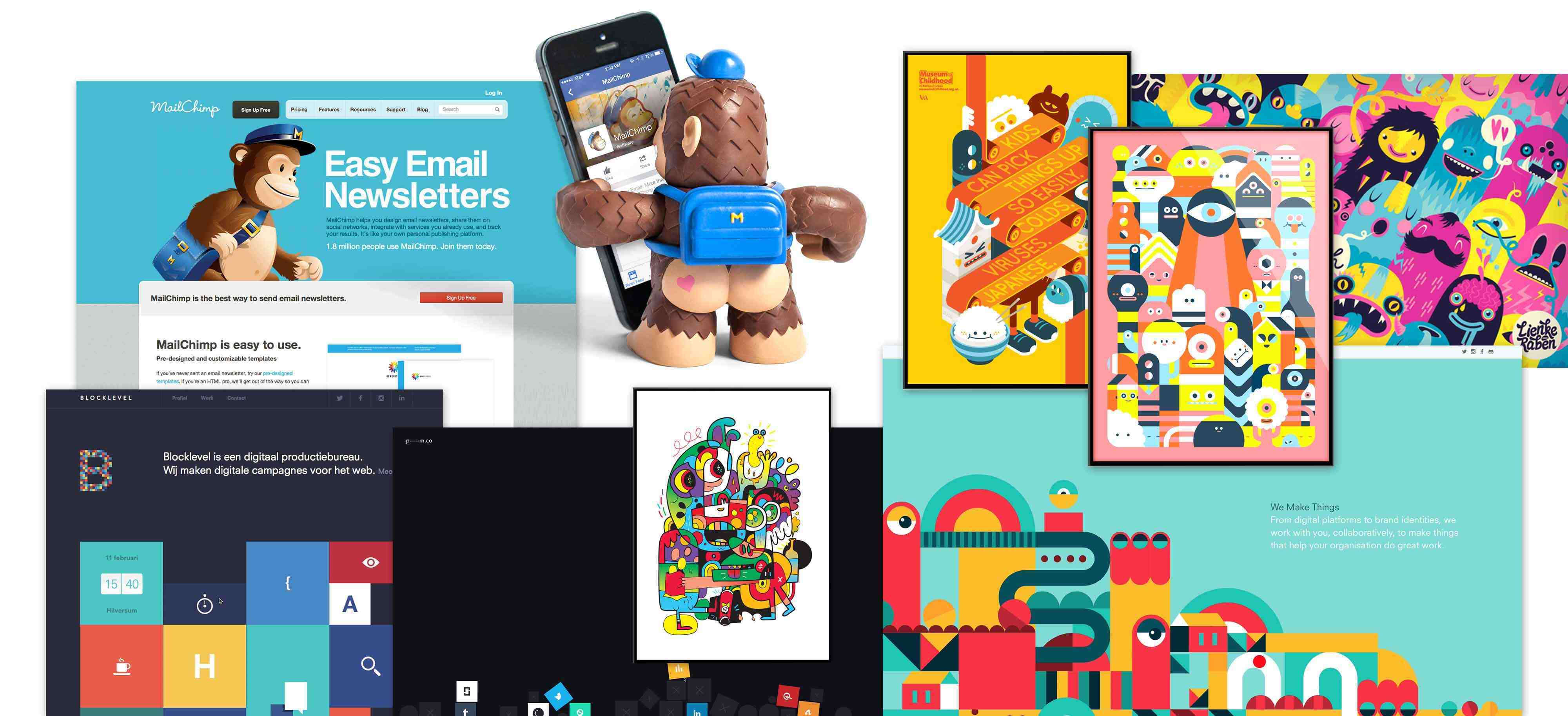
We loved the idea of using characters to represent the target audience. A way of directly communicating with people in a fun way.

Enter ‘The Digies’
We created a family of friendly, fun and unusual characters called The Digies. Each Digie has been carefully considered and represents members of the target audience.

Some of the Digie gang include ‘Hexy Hands’—the multi-tasking project manager, the slightly grumpy server dude ‘Dorky Devil’, ‘Cunning Carl’ the wise and meticulous UX designer and ‘Fuzzy Fiona’ the friendly front-end developer.

With the research and visual identity in place we've now handed over to the Digital Profile team who are finalising their product and getting ready to fully launch. We can't wait to see where they take the brand and the delightful Digies!

